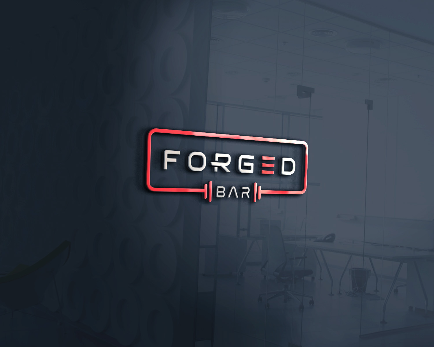
Forged Protein Bars Logo Design
Want to win a job like this?
This customer received 70 logo designs from 31 designers. They chose this logo design from Design Nation as the winning design.
Join for free Find Design Jobs-
 C$120
C$120
-
 70 designs
-
 31 designers
Logo Design Brief
Forged Protein Bars is a brand new start up in SK Canada, providing the best quality protein bars for the weightlifting and bodybuilding crowd. We pride ourselves in cutting zero corners, and providing everything that's to be desired in a protein bar.
We are looking for a very simple, yet modern logo that represents strength and power. We would like a simple graphic that resembles forging (a hammer, blacksmith swinging, anvil, etc), anything related that can be simplified and made to look sleek and powerful. Since these are protein bars, incorporation of a barbell within the logo to represent weightlifting would also be a neat idea. I would like neutral colors, and nothing too flashy. This logo would be used on everything from merchandise, to business cards. I have attached a concept/idea of a logo I have created, but would like to see what else can be done, or if that can be approved upon. I am not too stuck on anything though, so let your imagination free! Thanks!
Target Market(s)
Weightlifters and Bodybuilders
Industry/Entity Type
Supplement
Logo Text
Forged Bar
Logo styles of interest
Pictorial/Combination Logo
A real-world object (optional text)
Abstract Logo
Conceptual / symbolic (optional text)
Font styles to use
Other font styles liked:
- Tele-Marines
Colors
Designer to choose colors to be used in the design.
Look and feel
Each slider illustrates characteristics of the customer's brand and the style your logo design should communicate.
Elegant
Bold
Playful
Serious
Traditional
Modern
Personable
Professional
Feminine
Masculine
Colorful
Conservative
Economical
Upmarket
Requirements
Must have
- A graphic representing "Forging", must be simple yet powerful.
- Neutral colors
- Powerful font
- Transparency for applying to different applications
Nice to have
- Barbell incorporated within the logo (representing the protein "bar" aspect)
- Prefer the letter "E" within "Forged" to have the 3 lines that make up the letter
Should not have
- Anything too flashy and colorful