Catsitting retro logo redesign
Want to win a job like this?
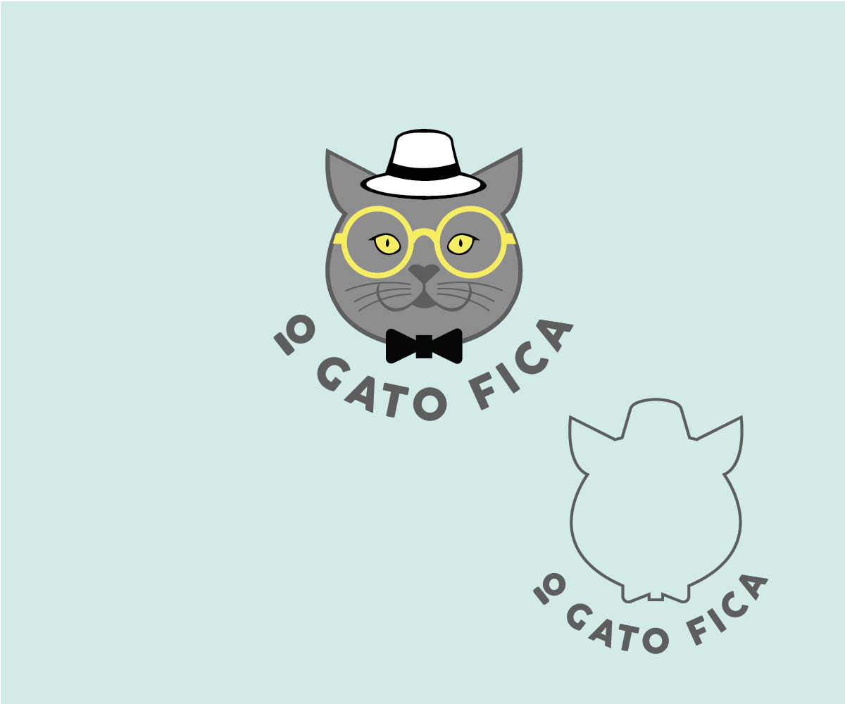
This customer received 167 logo designs from 54 designers. They chose this logo design from renderman as the winning design.
Join for free Find Design Jobs-
 €290
€290
-
 167 designs
-
 54 designers
Logo Design Brief
We are the first Catsitting service in Portugal, born in 2014 and now with up to 1000 cats under our watch (www.ogatofica.com).
We're called "O Gato Fica", which means "The Cat Stays", paying justice to the fact that cats are territorial animals and prefer to stay at home alone instead of going to a pet hotel when their humans are away.
Our main service is catsitting, but we also provide other feline services, such as behavioural consultations, training sessions, etc.
Our original logo (see attachments) was very successful and has attracted many customers. However, it's more of an illustration, with too many details and we didn't buy exclusive use at the time.
This year we will go through a refresh of our image (refreshed logo, new website, new webcommercial). We want to keep a vintage/retro/sophisticated look and, at the same time, the colours that people have come to associate us with (that light teal - #d1ebe5). We also like shades of grey and yellow highlights.
We've also been attracted to the idea of our original logo's cat face being transformed in a kind of Origami cat face, made of different shades (see attachments).
UPDATE 8th May:
1) After seeing the first Origami submissions, I'm concerned if this would be too great a departure from the original logo, which we like so much. Please feel free to submit other ideas based on our requests and main concerns.
(We're still keen on seeing more Origami versions but open to other ideas.)
2) After seeing the first submissions I noticed that the light teal colour is what we use on the background (either of our webpage or our business cards). As such, it might make more sense that the new logo, like the original one, is in shades of grey (not light teal as that will remove contrast from the background), with yellow highlights. Eventually there could be two versions of the same logo: one with shades of light teal (to use on white background) and one with shades of grey (to be used in light teal background).
IMPORTANT UPDATE 10th of May
After seeing all the submissions and not feeling particularly happy with any of them (only one that is also an illustration) someone advised us that what we are looking for is a refresh of our logo, not a redesign. The main goals are:
- It should be vectorial;
- It should work in small scale such as a business card;-
- The font needs work because the striped texture isn't visible on a small scale.
- The alignment (maybe more than one possibility) between cat face and brand name should make it possible to be used on Facebook's square profile image and Instagram's round profile picture (or maybe we'll only use the face for this last one).
For this I uploaded the original version of the logo, for anyone who wants to try and improve it.
Many thanks!
Target Market(s)
catsitting, petsitting, pets
Logo Text
O Gato Fica
Logo styles of interest
Emblem Logo
Logo enclosed in a shape
Pictorial/Combination Logo
A real-world object (optional text)
Character Logo
Logo with illustration or character
Font styles to use
Colors
Colors selected by the customer to be used in the logo design:
Look and feel
Each slider illustrates characteristics of the customer's brand and the style your logo design should communicate.
Elegant
Bold
Playful
Serious
Traditional
Modern
Personable
Professional
Feminine
Masculine
Colorful
Conservative
Economical
Upmarket
Requirements
Must have
- - It should feature a cat face, ideally not the whole body. The cat should be based on a breed called British Shorthair (blue colour, which is the name for the grey colour in what concerns cat breed colours).
- - Colours should be around a light teal tone (#d1ebe5; see our original logo in the attachments and check our website www.ogatofica.com).
- - It must include the brand name "O Gato Fica".
- - PLEASE SEE 10TH OF MAY UPDATE
Nice to have
- - It would be nice to have the cat face anthropomorphized (looking like a human, by wearing human accessories).
- - We like a retro/vintage look.
- - It would be very important for the logo to nicely fit facebook's square profile picture for our page.
- (- We are attracted to the idea of an origami kind of logo.) PLEASE SEE 10TH OF MAY UPDATE