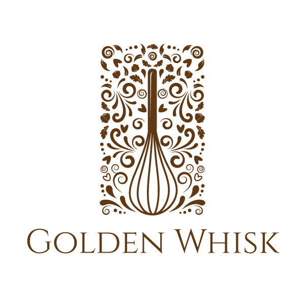
Logo for Boutique Confectioner "Golden Whisk"!
Want to win a job like this?
This customer received 148 logo designs from 36 designers. They chose this logo design from dalia sanad as the winning design.
Join for free Find Design Jobs- Guaranteed
-
 A$325
A$325
-
 148 designs
-
 36 designers
Logo Design Brief
"Golden Whisk" is a small confectionery manufacturer in Western Australia. We produce gourmet handmade confectionery targeted at adults who appreciate fine foods. We need a logo that will appear on all our product packaging, signage, business cards and all the usual places. We want the logo to reflect that our products are high quality, premium products without being too pretentious.
Updates
Thank you everyone for your submissions, we've enjoyed them very much, and been very impressed by your talents. There are a few elements that keep coming up that we don't like though, so we wanted to let you all know so you can avoid them:
- No burgundy or red please!
- If using a coloured font or icon, remember that it's going to be overlaid on many different package colours. So if your design includes a coloured font or icon, it should also have a frame to contain the background colour to match it.
- Remember, we have a maximum of 3 print colours. Some printing processes will not handle a colour gradient well.
Added Friday, December 20, 2013
Thank you very much for all your great designs. Two things we don't want to see more of:
- No more banner, ribbon or flag designs please
- No more initials "GW"
Added Sunday, December 22, 2013
Industry/Entity Type
Business
Logo Text
Golden Whisk
Logo styles of interest
Emblem Logo
Logo enclosed in a shape
Pictorial/Combination Logo
A real-world object (optional text)
Look and feel
Each slider illustrates characteristics of the customer's brand and the style your logo design should communicate.
Elegant
Bold
Playful
Serious
Traditional
Modern
Personable
Professional
Feminine
Masculine
Colorful
Conservative
Economical
Upmarket
Requirements
Must have
- A. Must contain the business name, "Golden Whisk". B. Up to 3 colours only, including black or white. C. Must be eye catching and have "shelf appeal". D. Must be compatible with different coloured backgrounds, as different flavours and products will have different coloured packaging. So if your design includes a coloured font or icon, it should also have a frame to contain the background colour to match it. E. Must reflect that the company provides premium products targeted at adults.
Should not have
- A. No literal drawings of a whisk, unless it's very dynamic. B. No designs targeted at children (not cartoon style, comical etc.) C. No faux rustic style. D. No candy stripes. E. Should not be overly pretentious - we want to appear premium but still approachable. F. NO RED OR BURGUNDY PLEASE! G. No banners or ribbons H. No initials "GW"