'Noize Nectar Music' needs Logo Design
Want to win a job like this?
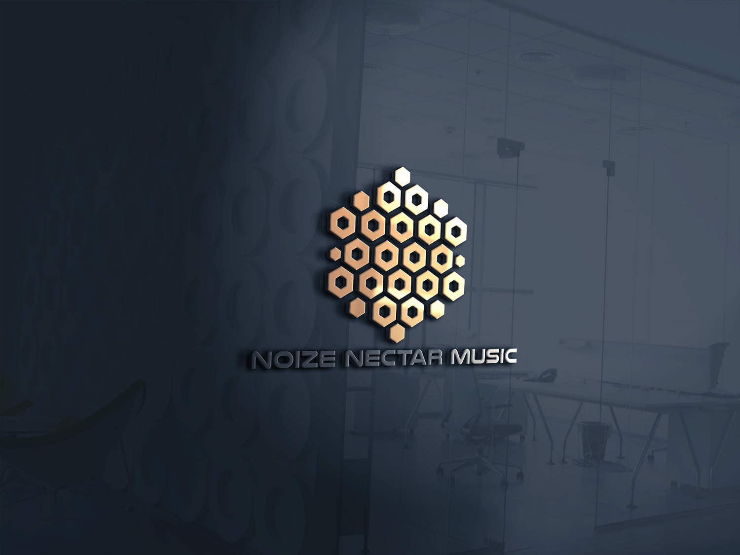
This customer received 135 logo designs from 29 designers. They chose this logo design from DesignDUO as the winning design.
Join for free Find Design Jobs- Guaranteed
-
 US$150
-
 135 designs
-
 29 designers
Logo Design Brief
Logo Design - The Company is a Music Library (Licenses music out to Productions Companies for use in Media. Name: Noize Nectar Music. I am flexible on the logo design although there is one I had envisioned that is a Hive of Honeycomb with each Comb being a speaker. I would like it to be somewhat 3D looking if possible but not too busy or complex, also not too simple. I am also flexible on the color scheme so do not feel limited to a honey-like color although that is acceptable as well. It will need to be versatile enough to be used on a website, Letterhead, Business cards, etc
Target Market(s)
Media Production / Music Composers
Logo Text
Noize Nectar Music
Logo styles of interest
Emblem Logo
Logo enclosed in a shape
Pictorial/Combination Logo
A real-world object (optional text)
Font styles to use
Other font styles liked:
- Open to Ideas - A unique font is preferred that is some what rugged or fits the concept of Nectar. Must be easy to read so if a dripping text is used it need to be minimal on the dripping.
Colors
Designer to choose colors to be used in the design.
Look and feel
Each slider illustrates characteristics of the customer's brand and the style your logo design should communicate.
Elegant
Bold
Playful
Serious
Traditional
Modern
Personable
Professional
Feminine
Masculine
Colorful
Conservative
Economical
Upmarket
Requirements
Must have
- - Name: Noize Nectar Music
- - Imagery - Open to other concepts but did give base concept I though was interesting
- - If Hive concept is adopted then please not the the speakers will be speaker cones and not the whole speaker case. Imagine the Hive is case for the speaker and each comb contains a speaker cone - Image of a speaker cone was provided in case this was not a know part of the speaker for anyone.
Nice to have
- 3D aspect, maybe slightly angled as if not quite looking directly in front of the Logo (the angle rotation should be subtle is any). Good balance between complexity and simplicity. Also the image of the speaker cone can be use as a base line for the color scheme if preferred although, is open ended to your own creativity.
Should not have
- Should not have too much going on. If the Hive concept is adopted then it should not be so busy that its hard to focus on the details of the hive/speakers. Should not have too many colors. I see a common color throughout the whole Logo mixed with some darker colors (black, silver, or grays to make the speakers) although I do not not want to hinder any creativity so don't lets speaker color be a defining thing of your design. If you see something that you feel just works without the darker colors of the speaker then go ahead and try it.