Tropical Island Branding Logo
Want to win a job like this?
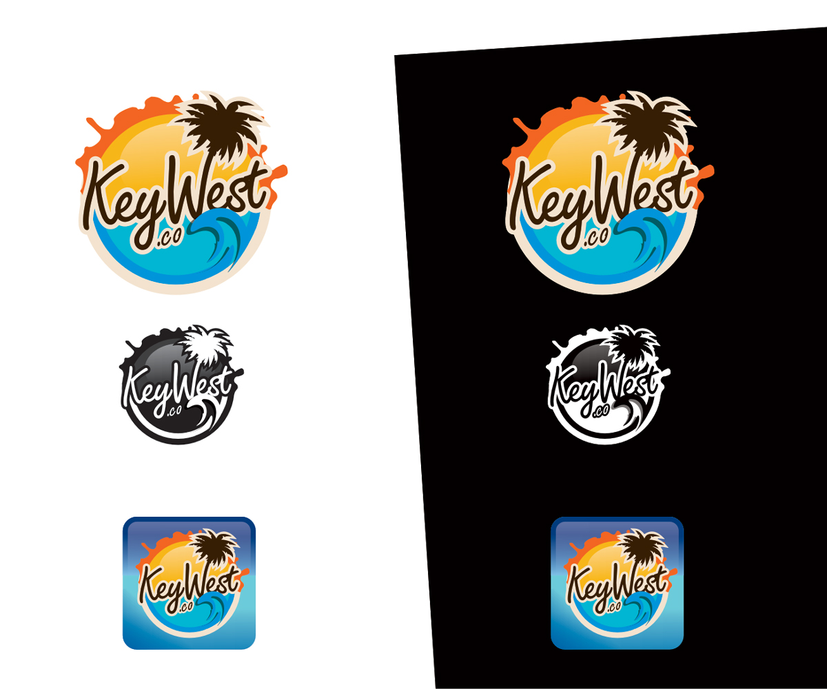
This customer received 66 logo designs from 20 designers. They chose this logo design from chesta as the winning design.
Join for free Find Design Jobs- Guaranteed
-
 US$200
-
 66 designs
-
 20 designers
Logo Design Brief
We need a logo design for a new website based in Key West, Florida (KEYWEST.CO).
"Key West is a tropical island, beaches, beautiful light-blue water and red sunset with palm-trees (no surfers, no waves). A paradise with crazy nightlife."
- the website is most popular on Facebook and logo must fit Facebook page also stand out of list when people are tagging places ( ☛ fb.com/keywest.fl )
- there is a high chance of flipping to mobile (iPhone app, for that reason the logo should fit an iPhone app and preferably stand out with colors or else).
- the website will be rebuilt by melting together www.keywest.co and www.keywestnight.com (please see actual logos / attached to this brief)
- there is a new brand that will be built on this initial work
The website has two sections:
1. Key West, beach, sunset, palm-trees and paradise (no surfers, no waves). Key West is about beautiful beaches, relaxing getaways and beautiful sunsets. Beach, relax, sunset and paradise. The actual logo ( ☛ http://goo.gl/kOwwLV ) gives you an idea, however it is not perfect.
What we like is the burning-melting sun (this is something that could/may stay if fits your idea). The other two elements, water and palm-trees must be included but not necessary the same way. For instance, the water reminds me of a surf paradise not a relaxing beach because of the waves.
What I am trying to explain is that the huge, burning sun is the key element and should stay in a way the designer thinks is best. There must be water and palm-trees, again as you feel it looks best. Essentially I don't even mind seeing the almost same logo what they have now, fixed up a lot. An original idea may also surprise us so I am open to anything, just remember: beautiful beaches, relaxing getaways and beautiful sunsets. The "Key West" text must be included on the logo but the logo has to look good without the text as well (horizontal placing of text next to logo on facebook and mobile devices).
2. Key West Nightlife is the opposite. As the sun goes down, Key West is about wild nightlife, clubs, bars and craziness, however, everything is 'hidden' under a beautiful darkness with the breeze from the ocean. The actual logo ( ☛ http://goo.gl/o6nAzJ ) is very easy to remember and tells you the story of what is happening after the burning sun goes behind the darkness however, we don't see the "special" in the existing logo. Here is the actual website for the nightlife ( http://keywestnight.com/ ) for ideas.
Since ☛ these two websites are getting melted together (!), the two logos must match somehow. Basically the night-logo could be the dark version of the keywest.co logo made of one color only (black/white). There is a high chance of flipping to mobile (iPhone app, for that reason the logo should fit an iPhone app and preferably stand out with colors or else). We are looking for bringing those two logos close to each other or creating the keywest.co (first) logo and match the night to it. The night version of the logo must be ready for one color printing.
COLORS: no preference, however the main colors must be the colors of the ocean ( ☛ http://goo.gl/HwBBNb OR http://goo.gl/VLOhCS ) complemented with one or two warm/bright colors, representing the sun. The palm-trees can be as you prefer, dark shadows or even same color as water/sun showing only the contour (as you dream it).
DETAILS: the night version must be printable with one color, background is deep purple or black while must resemble the daytime version
TEXT: the logo must look good WITH AND WITHOUT the "Key West" text on it (night version not a must).
SIZE: the logo must fit an Apple iPhone 3GS icon and still look perfectly clear. It should also fit a 16x16 favicon but details can be removed to achieve that size. Large sizes should look same as the iPhone icon.
OTHER: any cool or original idea that looks different but is resembling the feeling of Key West is welcome. You don't HAVE to follow my guidelines, however, this is where we evolved in the past 4 years. Lots of visitors have different taste and that is hard to please. Still, I am open to originality. Regarding the colors, light blue, greenish-blue, the colors of the sky and ocean is something that you should keep unless you really know what you are doing ;)
I hope I explained everything well enough. Thank you for reading and looking for awesome logos!
Updates
Dear Artists,
- the actual logo (http://goo.gl/kOwwLV) gives you an idea, however it is not perfect
- the actual logo 2 (http://goo.gl/o6nAzJ) .. but I don't see the "special" in it
- these two websites are getting melted together, the two logos must match somehow
- COLORS: no preference, however the main colors must be the colors of the ocean ( http://goo.gl/HwBBNb ) complemented with one or two warm/bright colors, representing the sun
- the logo must look good WITH AND WITHOUT the "Key West" text on it
- the logo must fit an Apple iPhone 3GS icon and still look perfectly clear
Added Monday, December 16, 2013
It makes a lot of sense if you go to the Key West facebook page and see, where the logo should fit. Taking a look at the cover image, page and first dozen posts, you will have an idea and feeling about what they need: www.facebook.com/keywest.fl
Added Monday, December 16, 2013
Please take a look at this guideline and the hint that keywest.co may be looking for a logo to switch to mobile (iPhone App): http://www.designcrowd.com/file.aspx?fileLocation=storage_url/brief_uploads/334717_guidelines_brief164401.png
Added Tuesday, December 17, 2013
Project Deadline Extended
Reason: We did not find what we are looking yet. Some designs are very close but we decided to extend deadline with 15 days due to holidays.
Added Sunday, December 22, 2013
Project Deadline Extended
Reason: At this point we have 3 designs, one of these 3 will be selected if no one sends something that fits our needs better in the next 15 days. Thank you all!
Added Monday, January 06, 2014
Project Deadline Extended
Reason: Still looking for something ... a detail that is somewhat missing, a feeling that makes the logo unique and loved. We have 3 contestants who are close enough to succeed if nothing else shows up.
Added Tuesday, January 21, 2014
Project Deadline Extended
Reason: For user chesta to upload variations
Added Saturday, February 08, 2014
Project Deadline Extended
Reason: Out of office Feb 20-28
Added Friday, February 14, 2014
Target Market(s)
Age between 25-75!
Industry/Entity Type
Printing
Logo Text
Key West
Logo styles of interest
Pictorial/Combination Logo
A real-world object (optional text)
Look and feel
Each slider illustrates characteristics of the customer's brand and the style your logo design should communicate.
Elegant
Bold
Playful
Serious
Traditional
Modern
Personable
Professional
Feminine
Masculine
Colorful
Conservative
Economical
Upmarket
Requirements
Must have
- - day and night version
- with and without text
- must fit well iPhone 3GS icon
- must stand out from the list on Facebook (see image attached)
Nice to have
- - sun, palm trees, beach/water (unless you have something really original)
- bright blue, turquoise colors of the sky and ocean (http://goo.gl/HwBBNb)
- one or more complementary colors for sun/trees
Should not have
- - crowded details (we are looking for something clean)