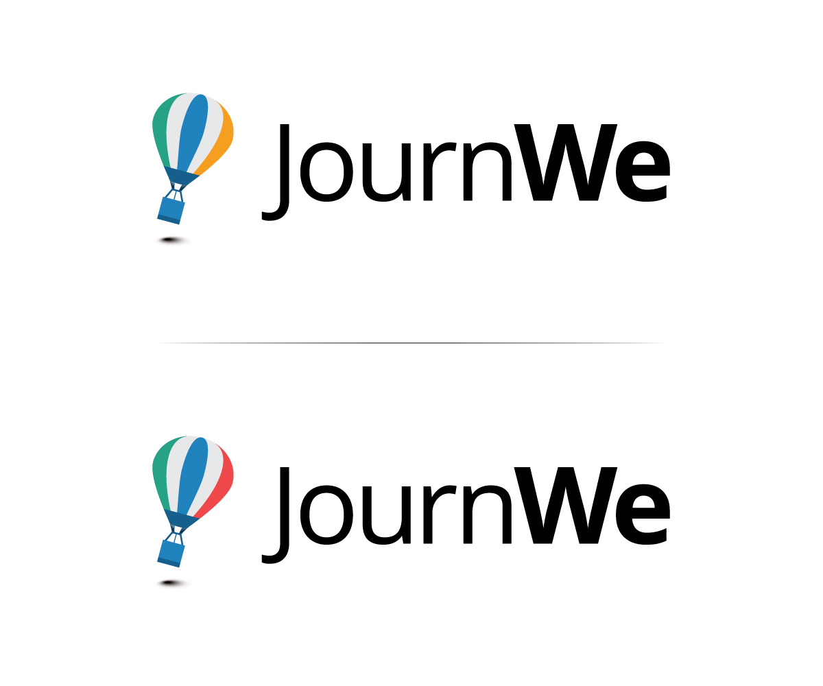
JournWe Logo

Want to win a job like this?
This customer received 108 logo designs from 28 designers. They chose this logo design from Neil as the winning design.
Join for free Find Design Jobs- Guaranteed
Logo Design Brief
Our Website JournWe.com needs a new logo.
JournWe is a group travel Website that helps you to start trips (adventures) with your friends. Our application solves decision making problems, such as: where to go, when to go, who is in the travel group? Furthermore, JournWe helps planning and organizing a group travel with additional features, such as discussion threads and shared to-do lists.
JournWe currently has a logo that consists of three colored circles which symbolize "make travel destination decision", "make travel time slot decision", and "invite additional friends to join the group travel". The current logo is attached. We would like to have a logo that is more catchy/memorable and interesting.
UPDATE:
We have just received an update from our designer we are working together with to design the homepage itself. We want to share them with you as they much better show how and where the logo will be used in future. The colors are not 100% final (the green and the blue are too close) but it will certainly go in this direction.
The first screen starting with "Willkommen zurück" is the home page. Here the logo will be used in the upper left corner in the header. In addition the current logo is used as a functional logo (as it represents the three elements place, time and travellers). If all three elements are represented in the logo it could also in future in some way serve as a functional logo.
The second screen is our landing page when the user is not yet logged on. Here the logo will also be used in the upper left corner. The big box in the middle will explain what JournWe is for and how it works. Regarding place, time and traveller we surely would use some of the logo elements here during the introduction and explanations.
You can see pretty much on your own what logo style would fit our (more flat) design of the page. Some examples of logo styles we think that would fit:
http://designmodo.com/animal-logos/
Updates
Dear designers,
thank you so much for all the awesome submissions.
We moved away from the three circles as we think a more creative, fun logo is more memorable than a very abstract/functional one. Current ideas mostly involve animals traveling together (representing the people on the trip) and incorporating the place and the time aspect in a creative way.
Please don't hesitate to submit alternative versions of your logo or new ideas that have a funny/happy animal in it.
Thanks,
JournWe team
Added Tuesday, December 10, 2013
Added Wednesday, December 11, 2013
Target Market(s)
18-40 year old travellers
Industry/Entity Type
Travel
Logo Text
JournWe
Logo styles of interest
Emblem Logo
Logo enclosed in a shape
Pictorial/Combination Logo
A real-world object (optional text)
Font styles to use
Look and feel
Each slider illustrates characteristics of the customer's brand and the style your logo design should communicate.
Elegant
Bold
Playful
Serious
Traditional
Modern
Personable
Professional
Feminine
Masculine
Colorful
Conservative
Economical
Upmarket
Requirements
Nice to have
- A logo with three elements that represent place, time, and travelers.