LogoDesign for housebuilder in Norway!
Want to win a job like this?
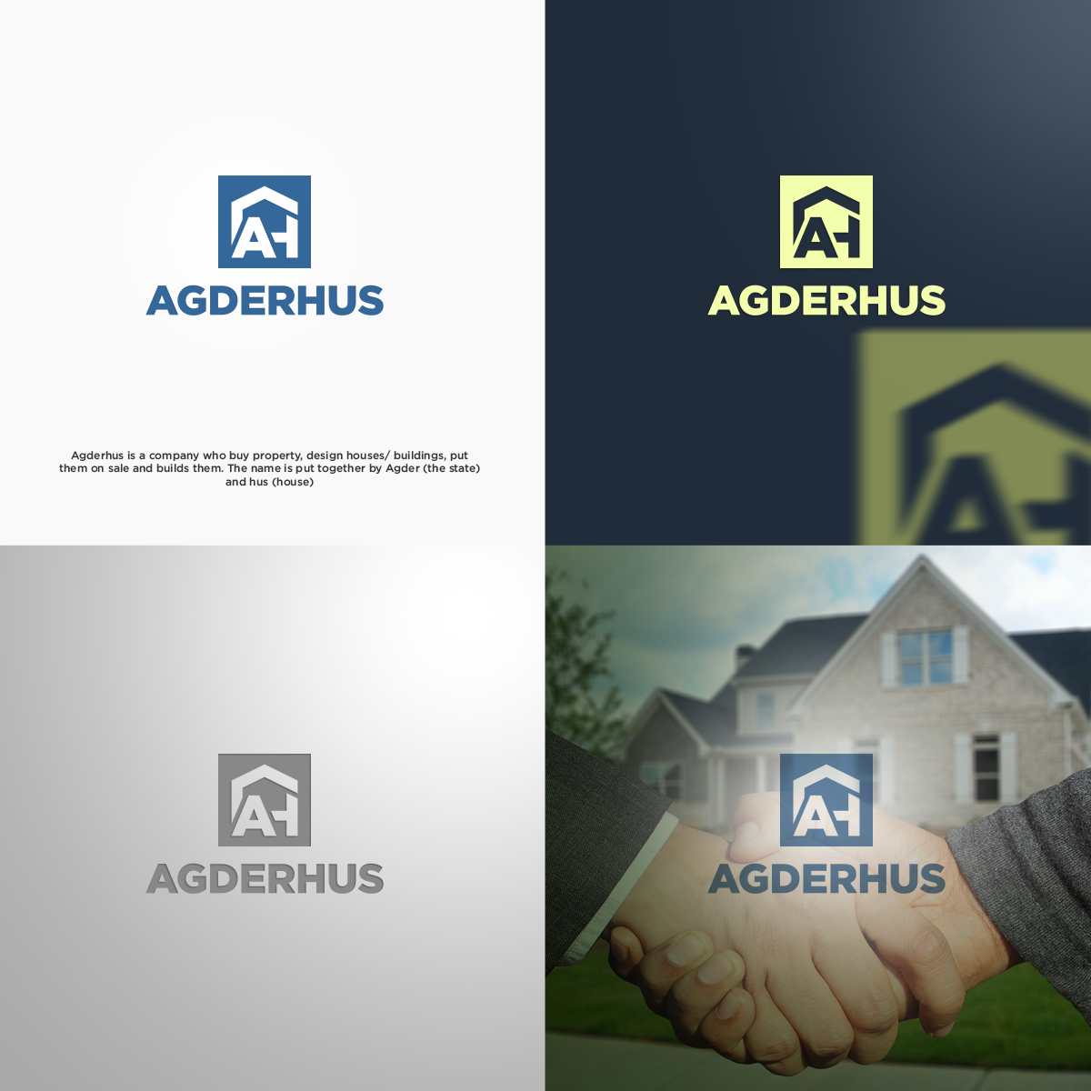
This customer received 223 logo designs from 95 designers. They chose this logo design from novita007 as the winning design.
Join for free Find Design Jobs-
 US$150
-
 223 designs
-
 95 designers
Logo Design Brief
Agderhus is a company who buy property, design houses/ buildings, put them on sale and builds them. The name is put together by Agder (the state) and hus (house). We focus on the southern part of Norway and like to reach out to the average people. Looking for a logo wich is easy to see from a distance, easy to read while passing by in the car, and if possible- with a undertone of construction/building/house etc. This could be a symbol. Focus on AH could also be a possibility.
Target Market(s)
1. Families with children. 2. Young adults. 3. People who wants a little more exclusive houses.
Industry/Entity Type
Real Estate Development
Logo Text
Agderhus
Font styles to use
Look and feel
Each slider illustrates characteristics of the customer's brand and the style your logo design should communicate.
Elegant
Bold
Playful
Serious
Traditional
Modern
Personable
Professional
Feminine
Masculine
Colorful
Conservative
Economical
Upmarket
Requirements
Must have
- se proj.description
Nice to have
- I like the name to be in focus- unless you make a symbol stronger than the text:)
Should not have
- 1. I do not like 'common' online logo type with roofs/silouttes over the text.
- 2. Small text og small symbols
- 3. Traditional style