ApotheTerrie Company Logo Project
Want to win a job like this?
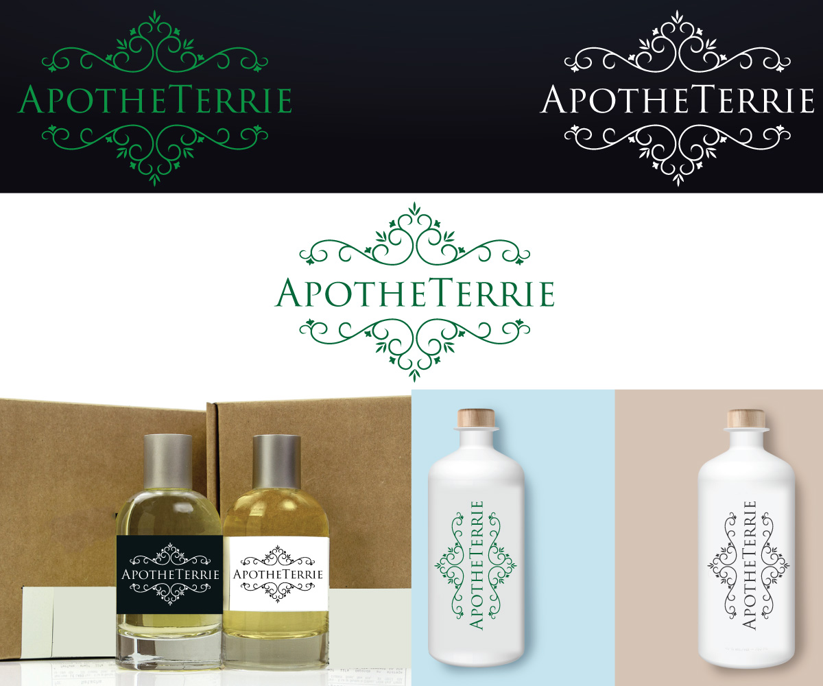
This customer received 188 logo designs from 63 designers. They chose this logo design from logoguider as the winning design.
Join for free Find Design Jobs-
 US$150
-
 188 designs
-
 63 designers
Logo Design Brief
ApotheTerrie is a start-up, online producer and retailer of chemical free, organic beauty and health products. Terrie, whose nickname is "T", is the founder and operator so the "T" should be a prominent design element. The company name is a play on the term, "apothecary" and the design should be reminiscent of the late 1800s. Some filigree incorporated would be appreciated. The logo design should easily incorporated into a product label design and a Wordpress header. ApotheTerrie creates lotions, soaps, facial scrubs, lip balms, and a variety of other clean living products.
Our label printer requires the following: Adobe Illustrator Native Format, CMYK color mode, 1/16" of bleed on all sides, 1/8" bleed on rounds, 1/16-1/8" of clearspace, fonts outlined or flattened, 300 dpi resolution with the image embedded.
Target Market(s)
Those interested in natural beauty and health care products
Industry/Entity Type
It Company
Logo Text
ApotheTerrie
Logo styles of interest
Wordmark Logo
Word or name based logo (text only)
Lettermark Logo
Acronym or letter based logo (text only)
Font styles to use
Colors
Colors selected by the customer to be used in the logo design:
Look and feel
Each slider illustrates characteristics of the customer's brand and the style your logo design should communicate.
Elegant
Bold
Playful
Serious
Traditional
Modern
Personable
Professional
Feminine
Masculine
Colorful
Conservative
Economical
Upmarket
Requirements
Must have
- Prominent "A" and "T" in style described.
Nice to have
- Filigree added, but need not be completely around any design.
Should not have
- The calligraphy too busy to not be legible in a smaller format ie: small product labels. No "Old English" font as it is too ornate.