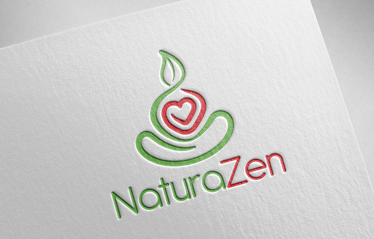
Restyle Logo of NaturaZen organic and natural Superfood
Want to win a job like this?
This customer received 183 logo designs from 48 designers. They chose this logo design from Daniel Caso Design as the winning design.
Join for free Find Design Jobs- Guaranteed
-
 US$150
-
 183 designs
-
 48 designers
Logo Design Brief
*** PLEASE READ WELL ALL THE BRIEF !!! ***
*** Publish Just ONE file of your concept Graphic Idea! ***
*** NO 3D Logo Effect please *** [ If I need I'll ask just when I'll be in the final decision ]
*** If I'll like your Hand and your Design I'll write you to send me more ideas to be able to parteciapte at the final decision ***
I Have actually the new Logo but I dont like some parts:
1) The legs ar similar to a cartoon
2) Leaf (head) maybe is good but can be improved a little like at example more separated from the body?
3) the heart in center of the body is nice and I like it
4) around heart there is a Green profile that can be improved because they should show like the arms around the heart.
5) Please be ORIGINAL, non just copy some LOGO you can find in Google Images in "yoga" "Organic" "zen" research (if I'll see I'll delete it immediately)
You can try for:
1) Light Restyle of actual Logo to Improve it
2) Big Restyle of actual Logo to Improve it
3) New Logo if you think to have a big IDEA
for NaturaZen that is an e-commerce that sell Organic and Natural Superfood.
The initial logo was a Zen Meditation Monach with a Leaf like a Head
This was the concept to join Natural (the leaf) with Spiritual (monach in meditation)
The colour was Orange/Red for the monach and Green for the leaf
I tried many time to change the logo but the results is always of a partial satisfaction, because a nice logo need to be:
1) well understable
2) well recognizable (also if small like in the Whatsapp Profile)
3) nice with Colur and also in B/N
4) Nice to see and to use in WebSite, in TShirt, in EMail for customer
5) need to represent the Brand in the best way
In the attachement I'll insert all the story of the logo to help you to find the best solution to Improve (if possible) the actual logo or redesign a new logo if you have a best idea that can represent me.
I like simple logo, I like precision and balance of lines and what I want is something better of what I made actually now.
What I dont like in ultimate Logo we have is something about it need to be redesigned in the legs and maybe find a best way to improve the rest.
If you have more question please write me!
I would see just a flat version in white paper of any different draw.
Name of society: NaturaZen
PayOff Logo: cibo crudo & biologico
Target Market(s)
Food and natural products, health product
Logo Text
NaturaZen
Logo styles of interest
Pictorial/Combination Logo
A real-world object (optional text)
Abstract Logo
Conceptual / symbolic (optional text)
Font styles to use
Other font styles liked:
- Any Font that is in Zen concept!
Colors
Colors selected by the customer to be used in the logo design:
Look and feel
Each slider illustrates characteristics of the customer's brand and the style your logo design should communicate.
Elegant
Bold
Playful
Serious
Traditional
Modern
Personable
Professional
Feminine
Masculine
Colorful
Conservative
Economical
Upmarket
Requirements
Must have
- Similarity with original logo should be preferred
Nice to have
- A clean well designed logo, originality, something that is nice to have for identify labels product, well recognisable
Should not have
- Something copied from other logo in the web, complex draw,