Revamp The Rick Moore Team Logo!
Want to win a job like this?
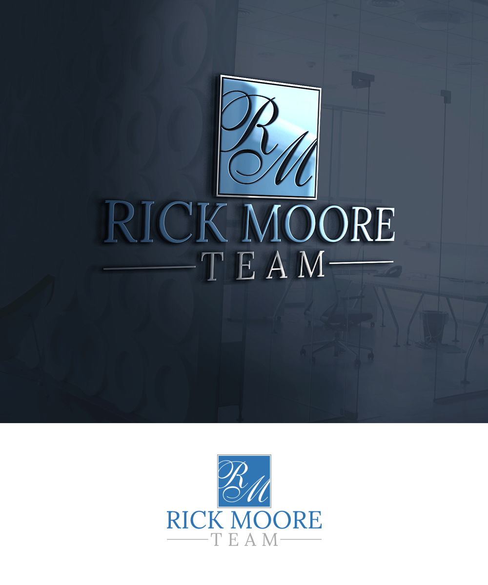
This customer received 193 logo designs from 55 designers. They chose this logo design from Creative Girl 2 as the winning design.
Join for free Find Design Jobs-
 US$150
-
 193 designs
-
 55 designers
Logo Design Brief
Hi Everyone! The Rick Moore Team is a real estate team in Kirkland WA, associated with Keller Williams. We need help Re-freshing our logos! We want to make them clean and crisp. We want the square logo that says "RM" to have a less swoop with the letters. And the one that has the square logo up top then says "Rick Moore Team" Below, the two fonts do not work well together. We really enjoy the wine logo, so if you could come up with something similar with "Rick Moore Team" that would be great. So we want a script font and a clean crisp font that work together. You can also play with the formatting where the square logo is placed with the words. We want to keep our colors blue, silver, white, and black. If you come up with a unique idea please show us! We are open to anything! We are excited to see your ideas!!
Target Market(s)
Real Estate Industry
Industry/Entity Type
Real Estate
Logo Text
Rick Moore Team
Font styles to use
Other font styles liked:
- Script and paired with a modern font
Colors
Colors selected by the customer to be used in the logo design:
Look and feel
Each slider illustrates characteristics of the customer's brand and the style your logo design should communicate.
Elegant
Bold
Playful
Serious
Traditional
Modern
Personable
Professional
Feminine
Masculine
Colorful
Conservative
Economical
Upmarket
Requirements
Must have
- RM and Rick Moore Team in logo's