New Company Logo focus on image
Want to win a job like this?
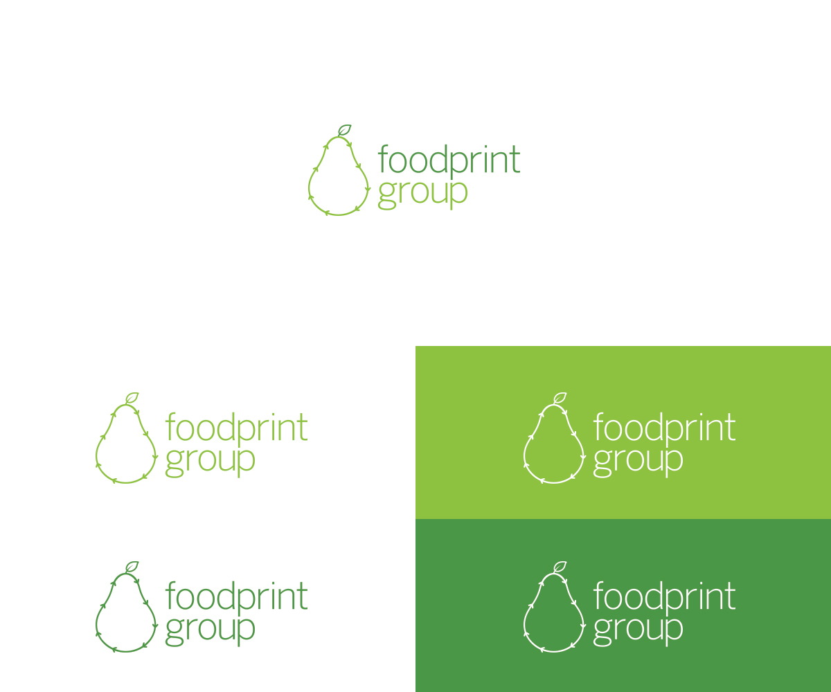
This customer received 139 logo designs from 43 designers. They chose this logo design from Alex C. as the winning design.
Join for free Find Design Jobs- Guaranteed
-
 US$150
-
 139 designs
-
 43 designers
Logo Design Brief
We need an updated logo that somehow communicates the NEW type of work that we do. Foodprint Group is a company that consults/works with businesses that have large food operations to reduce any waste related with operating a food business, we do this through creating waste management procedures and bringing in helpful infrastructure and best practices, we also create food donation programs and we standardize so a program can be rolled out at multiple locations. We aim to reduce not just food waste but any waste associated with their operation to reduce their costs. This is otherwise called working towards Zero Waste. It is about increasing materials to get into the recycling streams but also to reduce the waste in the first place. Truly focusing on the idea of reducing, reusing and recycling before landfill.
We would like to use the existing font (everything lower case) and colors see attached, so the focus should be to change the pear to an design that reflect what we do. Our current tagline is "Greening and Growing Food Businesses".
Apple's logo with a bite taken out of the apple is a good example, but obviously we can't do that. We are not looking for the basic recycling 3 arrow image to convey our message, but the idea of circular is OK to play with, it just has to be very professional and design-y looking and not basic (a lot of our work is about design and we work with large companies, see attached for more info)
We would like the image part of the logo to be able to stand alone so that our company name does not always have to accompany the image.
We are about helping food businesses through reducing waste using design and behavior change.
Another concept to think about that we follow as close as possible for our clients is circular economy. A circular economy is an alternative to a traditional linear economy (make, use, dispose) in which we keep resources in use for as long as possible, extract the maximum value from them whilst in use, then recover and regenerate products and materials at the end of each service life. Image attached to support this concept.
The pear is not required, but the logo needs to make people think of food when they see it. Though apples are an easy green food and different then a pear we worry about it being so close to apple computers logo. Feel free to play with forks and knives too.
Our website (www.foodprintgroup.com) is NOT yet updated to reflect the new company mission. See attached for a bit and more detail.
Industry/Entity Type
It Company
Logo Text
foodprint group
Logo styles of interest
Pictorial/Combination Logo
A real-world object (optional text)
Font styles to use
Other font styles liked:
- benton sans light
Look and feel
Each slider illustrates characteristics of the customer's brand and the style your logo design should communicate.
Elegant
Bold
Playful
Serious
Traditional
Modern
Personable
Professional
Feminine
Masculine
Colorful
Conservative
Economical
Upmarket
Requirements
Must have
- see description, but must have a new image, should have something related to food in the logo.
Nice to have
- see description
Should not have
- see description