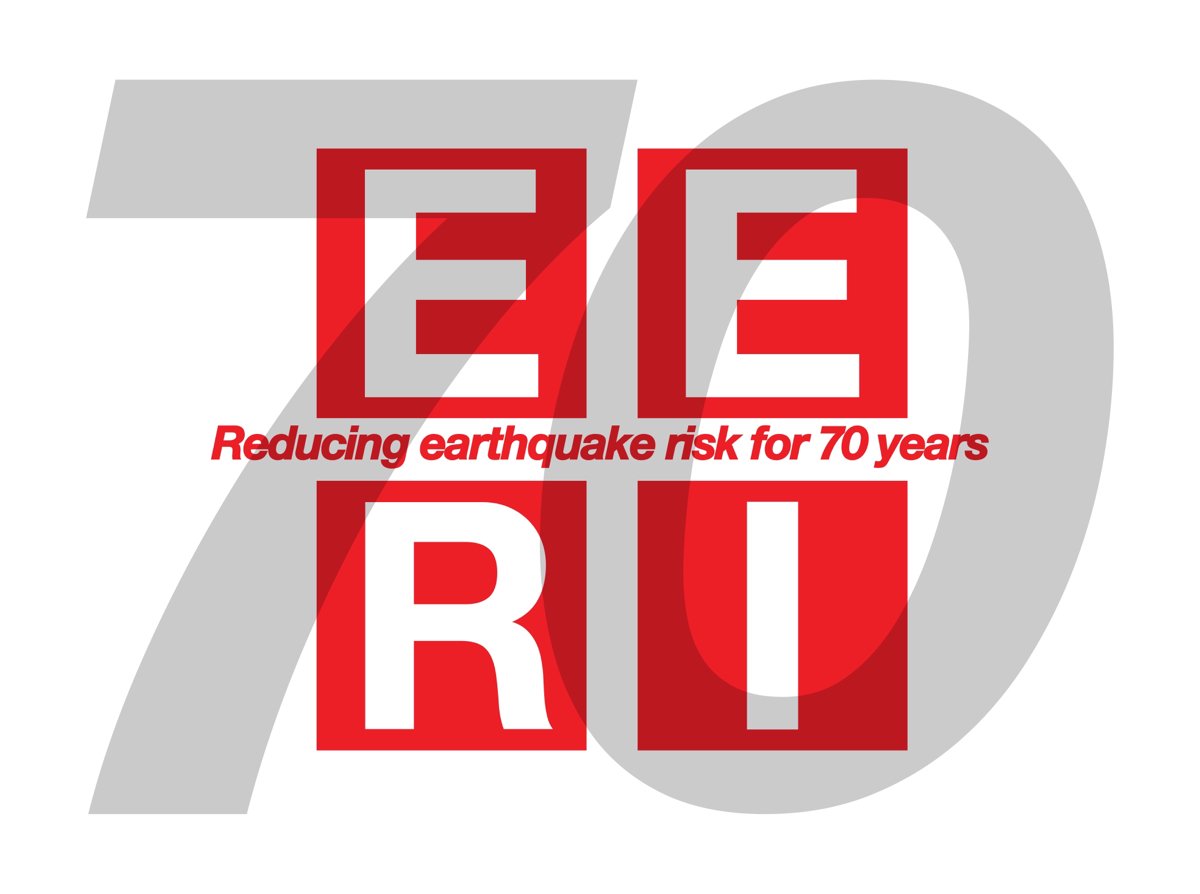
Earthquake Engineering Research Institute's (EERI) 70th Anniversary Special Edition Logo
Want to win a job like this?
This customer received 156 logo designs from 41 designers. They chose this logo design from nameci as the winning design.
Join for free Find Design Jobs-
 US$150
-
 156 designs
-
 41 designers
Logo Design Brief
The Earthquake Engineering Research Institute (EERI) turns 70 in 2018. EERI has been reducing earthquake risk since 1948. We've also used the same logo since 1948 - or so it seems! We'd like to update our logo (see attached file 3D Color High Rez) and add a callout or a burst to celebrate our 70th anniversary. The new logo should not be a complete departure from our current logo and will allude to and respect our original logo, as our members are rather traditional. The majority of our 3,000 members are engineers who are precise and mathematical, with brilliant minds. All of our members are committed to reducing earthquake risk around the world through better engineering, science, emergency management, and technology, and almost all live in earthquake-prone areas around the world. Conceptually, the logo will recognize the valuable work we do and the people who do it, while celebrating our 70th anniversary.
This special anniversary edition logo will be used throughout the year on our website, marketing materials, annual report, shown prominently in Los Angeles at our national earthquake engineering convention held only every four years, and will also be produced as a sticker (SWAG) that is given away to our members. I have attached our current, longtime logo, and 5 designs for inspiration. Please do not limit your designs to my inspirational designs, I like these designs but welcome creativity and originality! You can also check our websites www.eeri.org and 11ncee.org (the convention website).
Updates
Project Deadline Extended
Reason: Due to holiday schedules on staff, we will need extra time to decide on the winning design. Please submit any new designs as you wish, we are going through each design with great care and appreciation for your work!
Many thanks,
the EERI staff
Added Thursday, November 2, 2017
Target Market(s)
3,000 EERI members. EERI is a professional organization made up of of mostly structural structural engineers, geoscientists, geotechnical engineers, emergency management personnel, architects, urban planners and social scientists. Our membership is international.
Industry/Entity Type
Structural Engineering
Logo Text
EERI must be included and a callout or burst with "70 years" ; "70 yrs" ; or possibly "EERI. Reducing earthquake risk for 70 years"
Logo styles of interest
Abstract Logo
Conceptual / symbolic (optional text)
Font styles to use
Colors
Colors selected by the customer to be used in the logo design:
Look and feel
Each slider illustrates characteristics of the customer's brand and the style your logo design should communicate.
Elegant
Bold
Playful
Serious
Traditional
Modern
Personable
Professional
Feminine
Masculine
Colorful
Conservative
Economical
Upmarket
Requirements
Must have
- text: EERI
- A design element to recognize our 70th anniversary
Nice to have
- I'd like to stick to our current color theme but it would be nice to see other colors that would accent, highlight and modernize the present logo.
- It would be nice to see a version that includes the copy "Reducing earthquake risk for 70 years" if possible, but not necessary
- You could also try using our full name "Earthquake Engineering Research Institute" in some designs, though I cannot imagine how it will fit.
- However, if you want to play around with the full name, there is an acronym within that you could call out: "earthquake enginEERIng research institute" just a thought.
- It would be nice to update the current logo, not a lot , but to freshen it up.
- I'd like it to be something with scope so we can use it on everything from very large banners to print publications such as our annual report, digitally (website and email), SWAG -
- a baseball cap, sticker, etc.
Should not have
- Please try to stay close or stick to our colors, you can vary by adding accent colors, highlights, but nothing crazy. Our membership is rather conservative, and will not like something they don't recognize.
- I can't think of any other limitations.