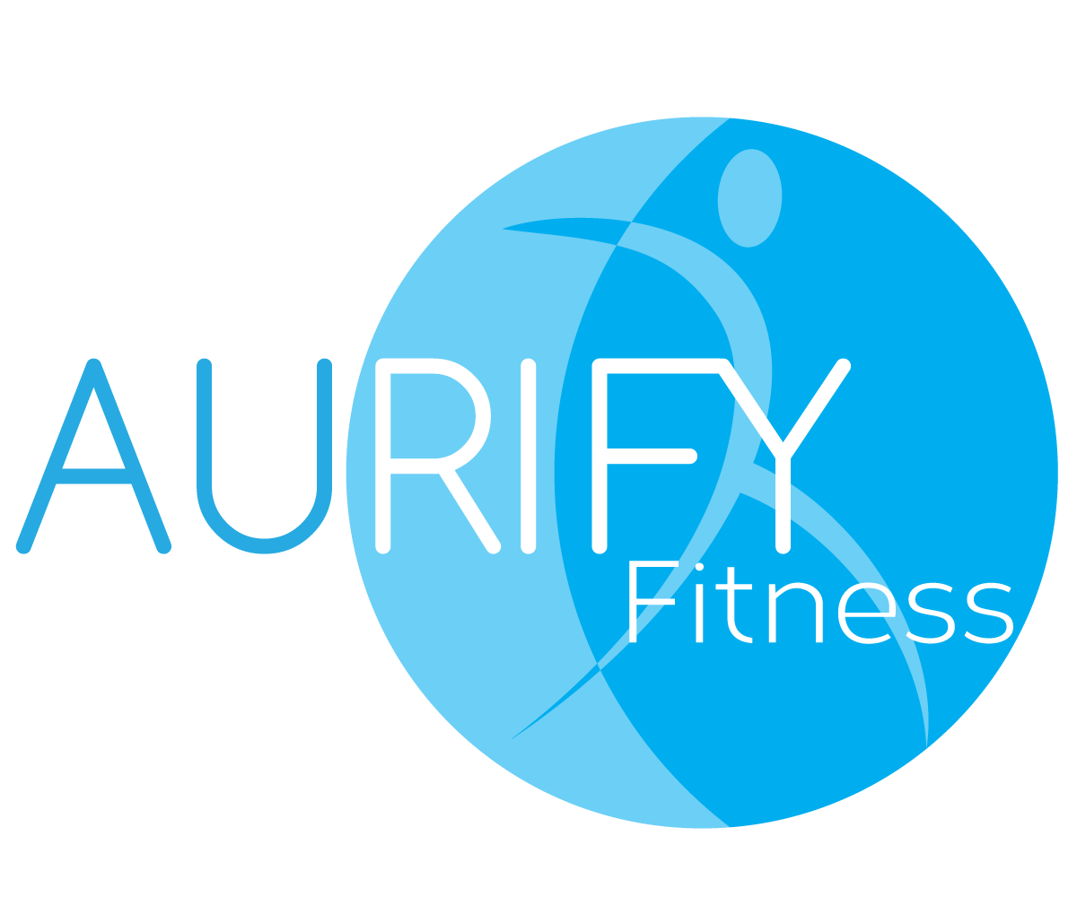
Mobile Personal Training Business

Want to win a job like this?
This customer received 60 logo designs from 13 designers. They chose this logo design from Hamish as the winning design.
Join for free Find Design Jobs- Guaranteed
Logo Design Brief
My business is called AURIFY Fitness - I'm a personal trainer.. and my point of difference is that I go to clients homes or parks to train them. Not necessarily in a gym. AURIFY - means to transform to gold..... AU is the periodic table/symbol for gold. So I would like to reference YELLOW in the business card or in particular the AU. It needs to be something that looks a little boutique without being kitch or too intimidating. Other colours could be navy or turquoise.... could be a shadow figure (something that makes it a little interesting) that changes its shape.. the text could also be AU-rify Fitness... a play on the AU but not married to that idea
Updates
The meaning of AURIFY is to transform to gold.... so the logo should have a “concept of transformation”. GOLD as a colour is really difficult to replicate.. so YELLOW is fine. The concept should be based on transformation regardless. The way I will be transforming clients will be with exercise.. how I came up with the name is basically word search...
Added Thursday, November 14, 2013
Project Deadline Extended
Reason: Still try to finalize logo with designer
Added Thursday, November 21, 2013
Target Market(s)
Stay at home mums/caregivers
Industry/Entity Type
Boutique
Logo Text
AURIFY Fitness
Logo styles of interest
Abstract Logo
Conceptual / symbolic (optional text)
Lettermark Logo
Acronym or letter based logo (text only)
Font styles to use
Colors
Designer to choose colors to be used in the design.
Look and feel
Each slider illustrates characteristics of the customer's brand and the style your logo design should communicate.
Elegant
Bold
Playful
Serious
Traditional
Modern
Personable
Professional
Feminine
Masculine
Colorful
Conservative
Economical
Upmarket
Requirements
Must have
- must be simple, clean - appealing to mainly women as the target audience is stay at home mums predominately. Don't mind if the LOGO is conceptual or letter based (NOT EMBLEM) *the logo style box would not let me unmark the WORDMARK OR EMBLEM LOGO...
Should not have
- no old style fonts, no pink or feminine references..... would like for someone to pick it up and say - thats cool, yeah I get it! No cheesy human figures in shadow form