Server Face-plate Design
Want to win a job like this?
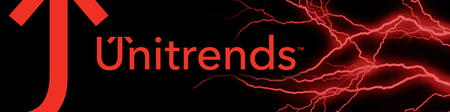
This customer received 87 graphic designs from 2 designers. They chose this graphic design from NiMo Studios as the winning design.
Join for free Find Design Jobs- Guaranteed
-
 US$500
-
 87 designs
-
 2 designers
Graphic Design Brief
Design a label that would be applied as a silkscreen to a server bezel face-plate.
Company Background:
Unitrends (www.unitrends.com) offers physical and virtual data protection appliances that provide very low total cost of ownership in terms of protecting and restoring critical data and systems. The family of disk-to-disk data protection appliances provides backup and rapid recovery of lost systems, applications, and unstructured and structured data as well as disaster recovery protection. Our Recovery SeriesTM Appliances provide for local backups, archiving, and remote replication. Coupled with our world-class customer support, these appliances provide an integrated, simple, and elegant solution that is designed from the ground-up for small- and medium-sized enterprises.
Project Theme:
Branding which communicates aggressive and edgy provider of data protection, business continuity & relevant, leading technology.
Key Messages:
Reliable, dependable
Business partner
Cool
Leading Edge Solution and Technology Provider
Color schemes:
Black, Silver/Gray, Red
Color Info:
Red:
HEX: #EE3524
Pantone 1795 M
CMYK: 0 94 100 0
RGB: 238 53 36
Gray:
HEX: #5f6062
Pantone 425 M
CMYK: 0 0 0 77
RGB: 95 96 98
Note: In the bezel designs, variations on silver may be used in the color scheme as a substitute for gray.
Unitrends Logo should be included in the design.
Updates
Most of what has been provided thus far has been "badges" rather than a full face-plate. The dimensions need to support the dimensions of a 1U, 2U and 3U computer rack server for a standard 19" rack. 1U is 1.75 inches high. To fit in a 19" rack the width is about 18 inches. Since there is space for LED lighting symbols, locks and end connectors, the actual canvas you'd be working with for a 2U is about 2-3 inches high and 12-13 inches wide. (We would then use the design to scale to the 1U and 3U form-factors).
Added Thursday, February 09, 2012
Please note that the examples provided are to give you an idea of the canvas. Review the brief for the color schemes, etc. While a "badge" may be a part of the design, the scope needs to include the full face-plate in consideration.
Added Thursday, February 09, 2012
Other examples provided. Again, these are simply for context ... the selected design will utilize our colors and logo in a manner similar to these examples but with unique creativity.
Added Thursday, February 09, 2012
Uploaded a variation of the logo (partial U with the clipped arrow). Try this or other variations of the logo in your designs.
Added Tuesday, February 14, 2012
For your design consideration, the full face-plate is available as a canvas, but it is not required that you take up the entire space. I have updated an example called FaceplatePartial for your viewing. (I don't particularly like this one for the color, but the shape is interesting and may be a consideration depending on the overall look).
Added Tuesday, February 14, 2012
As we approach the deadline, we are interested in alternatives for the logo and brand name placement. Please reference a new uploaded file (BrandNamePlacementExample). This is an example of another business with the logo featured prominently next to the name. The “architectural A” image of the logo in this example is then repeated byprominently calling out the A in the name as well. As a small company we want to brand with our name. Please experiment with the partial quarter U and then beside it“Unitrends” in grey or silver – or something like that.
The idea of interest being in the “U” – which is thequarter U – would be interesting – adding more detail to that.
Other comments will be added to some of the specific designs already submitted.
Added Tuesday, February 21, 2012
Near final call as we near the end of this project. Here are some general thoughts about the designs that are making it into the finals for the selection process. I hesitate to mention these because I don't want to damper creativity ... but within these thoughts, let us see some new ideas. (As you should notice now, the project is guaranteed and at $500.
- Black canvas.
- Red partial U (quarter-U arrow) as the logo - gives the impression of an amplified magnifying glass view of the U logo in Unitrends.
- Full name of Unitrends, not as large as the partial U-arrow, but prominent nonetheless. Placement may vary a) adjacent to the quarter-U-arrow or b) opposite side to the left with transitional gradient or designs. Colors to consider - adjacent: silver/grey; opposite: red, silver/grey or black.
- Single panel view. Design needs to appear connected without abrupt transitions. If multi-level panels are required, consider using a bridge panel which connects to the logo and removes the abruptness (i.e., black-to-black) and then shows gradient or a mix of the graphic integrated in the rest of the rectangular canvas.
- When using the gradient change (black transitioning to secondary color) consider using red or silver and for integration of the name consider name colors of black, red, or silver.
Added Wednesday, February 22, 2012
Target Market(s)
Small and medium enterprises (IT department)
Industry/Entity Type
Business
Look and feel
Each slider illustrates characteristics of the customer's brand and the style your logo design should communicate.