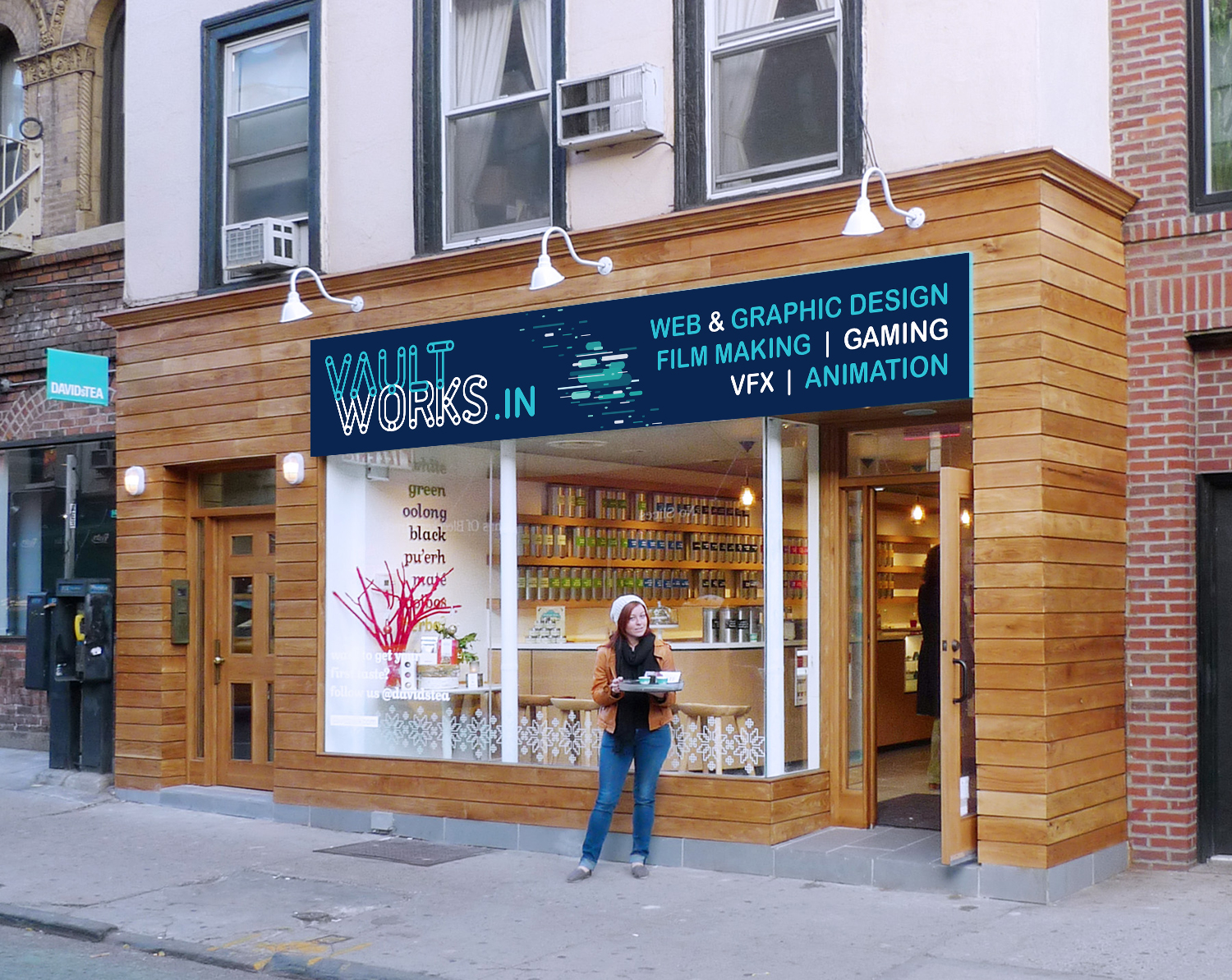
Signage for Design Academy - Exterior
Want to win a job like this?
This customer received 83 signage designs from 10 designers. They chose this signage design from mmmarif1982 as the winning design.
Join for free Find Design Jobs- Guaranteed
-
 US$190
-
 83 designs
-
 10 designers
Signage Design Brief
Size 32 ft x 5 ft 11 inches. It will be installed at a height of 25 feet. Should contain the Logo, Address, some courses to give an idea about what we do. The signage is installed on the 2nd floor, so the minimum size of letters would be as in the old signage design attached. The font size of the bottom line of our existing signage is as small as we should go. Basically it should be such that the first glance gives us an idea that it is a design academy. You are allowed to change the logo colors, but the font and design will remain the same.
Updates
Project Deadline Extended
Reason: some extra time might be needed to improve the designs and get new inputs. need some out of the box designing.
Added Saturday, September 23, 2017
Target Market(s)
High School and College going teens who wish to learn software skills for graphics and animation
Industry/Entity Type
Education
Font styles to use
Other font styles liked:
- Utopia
Colors
Designer to choose colors to be used in the design.
Look and feel
Each slider illustrates characteristics of the customer's brand and the style your logo design should communicate.
Elegant
Bold
Playful
Serious
Traditional
Modern
Personable
Professional
Feminine
Masculine
Colorful
Conservative
Economical
Upmarket
Requirements
Must have
- Logo, Address, Phone Number, website address, what we do.
- 1. Please refer to the image of our old signage uploaded. The font size of the courses mentioned at the bottom of the signage "ANIMATION, GAMING.." is the smallest size which is legible from the ground level.
- 2. We would like at least the web address in legible font size and if possible the phone number too. The physical address could be a little smaller as in the old signage, as that is not a calling factor and in case someone is interested, they can walk closer and read the address.
- 3. The calling factors would be a few courses and some graphics depicting what we do in the first look.
- 4.You are allowed to change the logo colors, but the font and design will remain the same. Prefer usage of Ubuntu font for text.
- 5. Prefer minimalist look and not cluttered. I feel mentioning more courses is making the signage cluttered. we can limit it to 3 courses.
Nice to have
- Graphics to suggest what we do. It should be eye catching. The graphic should be such that speaks of what we do. It should be suggestive.
Should not have
- It should not be too busy