rework current logo's + add new one same style
Want to win a job like this?
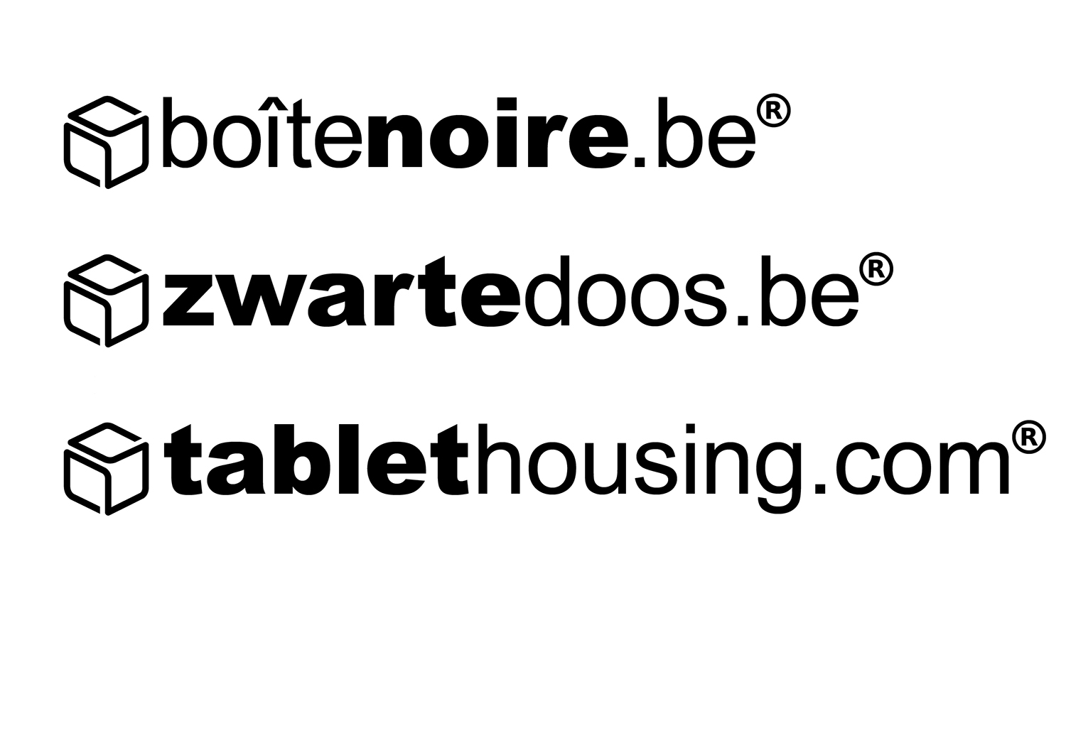
This customer received 31 logo designs from 9 designers. They chose this logo design from Freddie Paul as the winning design.
Join for free Find Design Jobs- Guaranteed
-
 €100
€100
-
 31 designs
-
 9 designers
Logo Design Brief
Rework current logo's :
- thickness of box symbol must be aligned with non bold character font drawing line's thickness
- be mindful of white spacing in symbol, we think it is better this is uniformed spaced (beginning, end and side/top size face)
- respect uniform spacing and gridlines over the total logo (text top & bottom should be aligned to top & bottom of the sides heights of the logo symbol
- new logo based on same design guidelines for product name "Tablethousing.com" (tablet in bold)
- size of symbol part and font size should be same for 3 variations
- input is requested how visually the right alignement vertically is done between first symbol part and text part.
Current logo's need to be put also in vector format.
Obviously is everbody with a bright out-of-the-box idea welcome : we are open for it
Updates
Project Deadline Extended Reason: No realistic deadline. Sorry for this. Added Sunday, September 17, 2017
Logo Text
See current enclosed logo's. (zwartedoos.be, boîtenoire.be, tablethousing.com)
Logo styles of interest
Abstract Logo
Conceptual / symbolic (optional text)
Font styles to use
Other font styles liked:
- Arial & Arial Black
Look and feel
Each slider illustrates characteristics of the customer's brand and the style your logo design should communicate.
Elegant
Bold
Playful
Serious
Traditional
Modern
Personable
Professional
Feminine
Masculine
Colorful
Conservative
Economical
Upmarket
Requirements
Should not have
- Color