

 Refresh
Logo and Business Card Design for an Architecture Office in New York
Add your question or comments below

The logo should be more square and geometric. I added 4 more reference logos for you to see what I am leaning towards.

I've submitted some creative design proposals for your
logo design according to your brief. Please provide your
feedback either to improve or move on with these designs.
Leopoldo sguera architect should be to the right of the square logo. The name should not be underneath the logo, nor centered. Please see the sketch logo on my website (upper left hand corner) and start by modifying or developing this concept further. I prefer square designs to diamond designs. The logo should focus on the L and the S (not so much on the A). So far I like the logos that have linear, geometric lines that intertwine the L and the S like a Celtic tattoo. However, use of the negative space in combination with continuous line work that would make it feel like a Japanese stamp and not a tattoo would be even better. Thank you all for your posts but I still haven't found exactly what I am looking for yet.

feedback please...
Check my design submit sir.
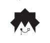
Feedback Please
-
 Previous page
- You're on page 1
- Page 1 of 1
-
 Next page
1 - 6 of 6 comments