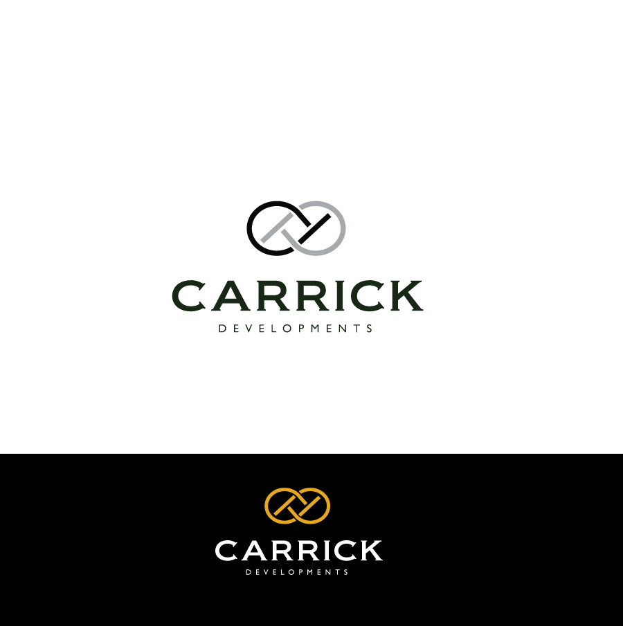
Property Development Business Logo

Want to win a job like this?
This customer received 231 logo designs from 87 designers. They chose this logo design from spontaneous as the winning design.
Join for free Find Design Jobs- Bundled Project 2
Logo Design Brief
Carrick Developments is a property development business based in Australia. The company focuses on creating small, bespoke, high-quality projects. The brand stands for premium quality, refinement, and modernity.
If the brand were a car, it would be a BMW 5 series or Tesla Model X. Why? Because these brands represent premium quality, craftsmanship, dependability and cutting edge design. The brand would not be a Toyota, because it is too mass market. It would not be a Rolls Royce because it is too glitzy and luxurious.
'Carrick' refers to a traditional nautical knot known as the 'Carrick Knot' or 'Carrick Bend' (https://en.wikipedia.org/wiki/Carrick_bend). This interwoven design has a long history. This knot is used to connect two separate pieces of rope together, and the knot is one of the strongest of nautical knots. Symbolically, this implies combining useless things together to make something useful and productive out of nothing - using technical know-how to create the strongest of knots from relatively simply inputs.
It is not absolutely necessary that the logo include some variation of the Carrick knot, though this would seem to make sense. The logo will be used on a webpage, email and letter correspondence, and advertising such as flyers and banners. It should be simple, but recognisable. The words 'Carrick Developments' should be included to build knowledge of this brand over time.
Industry/Entity Type
Business
Logo Text
Carrick Developments
Payments
Total
A$351
Project Deadline
07 Sep 2017 00:56:50 UTCProject Upgrades
Bundled project(s)
- offering A$49 stationery design to winner
- offering A$39 business card design to winner