Creative UI design for web application
Want to win a job like this?
This customer received 31 web designs from 11 designers. They chose this web design from pb as the winning design.
Join for free Find Design Jobs- Guaranteed
-
 A$230
A$230
-
 31 designs
-
 11 designers
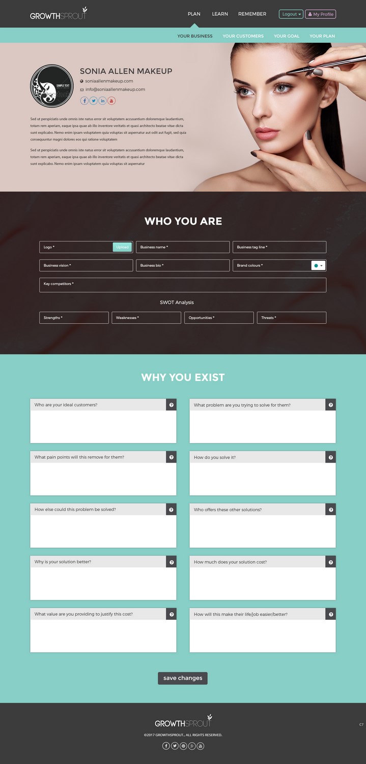
Web Design Brief
I need a new UI design for my web application. It will be used by small and micro business owners to plan & implement growth tactics.
I've attached the current design (which I'm open to be changed) - but in particular I need to design the centre of the screen, where the work actually happens.
There needs to be place for a title (YOUR BUSINESS) and description (say 1-2 paragraphs of text) - and am happy to include icons or imagery where makes sense. It may make sense for the user to be able to upload their business logo and name, for example.
This screen will be used by the business owner to understand the real value they offer potential customers and their point of difference - why they exist and why potential customers should care.
They'll use the information they put into this screen to plan things like their messaging.
Following that, there needs to be 2 sections in the dashboard.
The first section is titled "WHO YOU ARE"
The first section will include a number of boxes that the user can input information into, as follows:
- Logo
- Business name
- Business tag line
- Business vision
- Business bio
- Brand colours (these should end up as swatches based on the colour code they enter) - the colour code for each colour swatch should also be visible.
- Key competitors
- SWOT analysis (boxes to enter their strengths, weaknesses, opportunities and threats).
The second section is titled "WHY YOU EXIST"
The second section will include a number of boxes that the user can input information (text) into, as follows:
- Who are your ideal customers?
- What problem are you trying to solve for them?
- What pain points will this remove for them?
- How do you solve it?
- How else could this problem be solved?
- Who offers these other solutions?
- Why is your solution better?
- How much does your solution cost?
- What value are you providing to justify this cost?
- How will this make their life/job easier/better?
They should be able to write a decent amount of information in the boxes.
There should ideally be a place for a description for each of these text fields (for both section 1 & 2) as well so I can give them a little bit more direction around what to put in the box. Alternatively there could be a little icon (say a question mark or "i") that they could click on to view instructions. The instructions will be around 2-4 sentences long for each text field.
You have 2 options:
a) This all needs to appear on the one screen, and the navigation needs to be visible (as per the example attached but feel free to recreate this navigation)
Note: the page can scroll below the fold - but please provide the design for the full length of the page.
b) Potentially the 2 sections could actually be in 2 different items in the menu - YOUR BUSINESS and YOUR VALUE (which would sit next to YOUR BUSINESS and before YOUR CUSTOMER in the screenshot provided). feel free to design them as 2 separate screens if you prefer.
I have attached a screenshot of the app as it stands today (screen shot 2017) which would still exist in the new design but under a different section (the learn section from the plan2 mockup attached)
I have mocked up how this new screen could look if broken into 2 and that's also attached. If you can make this come to life - and look more engaging that would be helpful! :)
Target Market(s)
Small and micro business owners
Industry/Entity Type
Marketing
Number of Pages Required
1 page
Font styles to use
Other font styles liked:
- Montserrat
Colors
Colors selected by the customer to be used in the logo design:
Look and feel
Each slider illustrates characteristics of the customer's brand and the style your logo design should communicate.
Elegant
Bold
Playful
Serious
Traditional
Modern
Personable
Professional
Feminine
Masculine
Colorful
Conservative
Economical
Upmarket
Requirements
Must have
- Use of my brand colours: #cc8eb2, #76d6c8, #68c7ff as well as white and #595959. Must be visually pleasing / engaging, designed for desktop (as it's a desktop application), really easy to use / navigate.
- Use font Montserrat light & Montserrat Regular or Bold. Mostly should be Montserrat light.
Nice to have
- Would be nice to see how this would look on mobile (as the application is responsive) but this is not mandatory.
Should not have
- Should not look too corporate or dry.