Real estate logo for brother sister duo
Want to win a job like this?
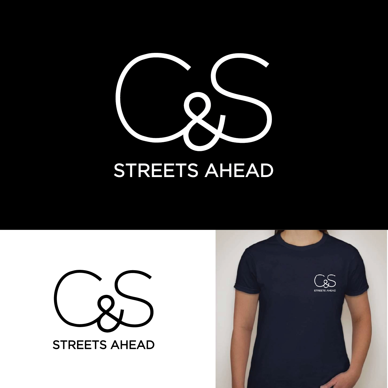
This customer received 187 logo designs from 69 designers. They chose this logo design from Adnan Ansari as the winning design.
Join for free Find Design Jobs- Guaranteed
-
 NZ$150
-
 187 designs
-
 69 designers
Logo Design Brief
We are a brother and sister residential real estate team based in Auckland New Zealand. We sell high end homes to diverse clients in the city fringe suburbs. The logo needs to be clean and simple as it will be used in multiple mediums, from print, digital to roadside advertising. Keen to make ourselves stand out!
Target Market(s)
Professional couples, young families, gay couples, baby boomers, those that value integrity, professionalism and results
Industry/Entity Type
Real Estate Agent
Logo Text
Streets Ahead C & S
Logo styles of interest
Emblem Logo
Logo enclosed in a shape
Wordmark Logo
Word or name based logo (text only)
Font styles to use
Colors
Colors selected by the customer to be used in the logo design:
Look and feel
Each slider illustrates characteristics of the customer's brand and the style your logo design should communicate.
Elegant
Bold
Playful
Serious
Traditional
Modern
Personable
Professional
Feminine
Masculine
Colorful
Conservative
Economical
Upmarket
Requirements
Must have
- Clean simple aesthetic, easily recognizable even from a distance (20m) people doing drive bys etc.
- Bold & Simple
- Modern and contemporary, but appealing to a wide audience.
- Not fussy
Nice to have
- We are a brother and sister team not a husband and wife team.
- Not sure how this would be reflected in any branding, but good to keep in mind.
Should not have
- Not be polarising
- No pictorial images