

 Refresh
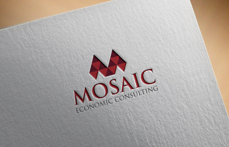
Mosaic Economic Consulting logo
Want to win a job like this?
This customer received 291 logo designs from 85 designers. They chose this logo design from asman as the winning design.
Join for free Find Design Jobs
-
 US$150
-
 291 designs
-
 85 designers
Logo Design Brief
A logo for a consulting company that looks like a mosaic, perhaps with some of the tiles 'falling into place.' Most likely it would be just compelling geometry, but it could also incorporate the 'M' of Mosaic into the tiles. Should be scalable so it looks good on a business card as a kind of icon (i.e. on a single line: <icon> Mosaic Economic Consulting LLC), but also look good at larger sizes on a website. Colors should favor deep red (blood red, burgundy, and such) and grey. The text of the company name shouldn't be in the logo but will appear often next to it.
Target Market(s)
Law firms, energy companies, financial sector.
Industry/Entity Type
It Company
Logo Text
Mosaic Economic Consulting
Logo styles of interest
Abstract Logo
Conceptual / symbolic (optional text)



Font styles to use

Colors
Colors selected by the customer to be used in the logo design:
Look and feel
Each slider illustrates characteristics of the customer's brand and the style your logo design should communicate.
Elegant
Bold
Playful
Serious
Traditional
Modern
Personable
Professional
Feminine
Masculine
Colorful
Conservative
Economical
Upmarket
Requirements
Must have
- Logo must recall artistic mosaics rather than kitchen or bathroom tiles, but not be so complex that it can't be represented on a small scale, like in the corner of a business card. Colors are fairly flexible but should tend toward the darker reds without looking too brown.
Nice to have
- If there could be a few tiles of the mosaic logo that are not fully in place but are 'falling into place,' that would be excellent and coincide with the reason we chose the name Mosaic Economic Consulting. If it's possible to have an 'M' in the tiles, that could be interesting, but not at the expense of a clean design. Logo can incorporate "Mosaic Economic Consulting" to the right of the mosaic design, or better yet a version with the design and one with the design+words.
Should not have
- Shouldn't have so much detail that it doesn't scale well. Although I want the logo to be reminiscent of mosaic art and not bathroom tiles, I don't want it to be mistaken for old Byzantine religious art either. Don't have the name of the company in the actual mosaic logo, except possibly an M in the mosaic.