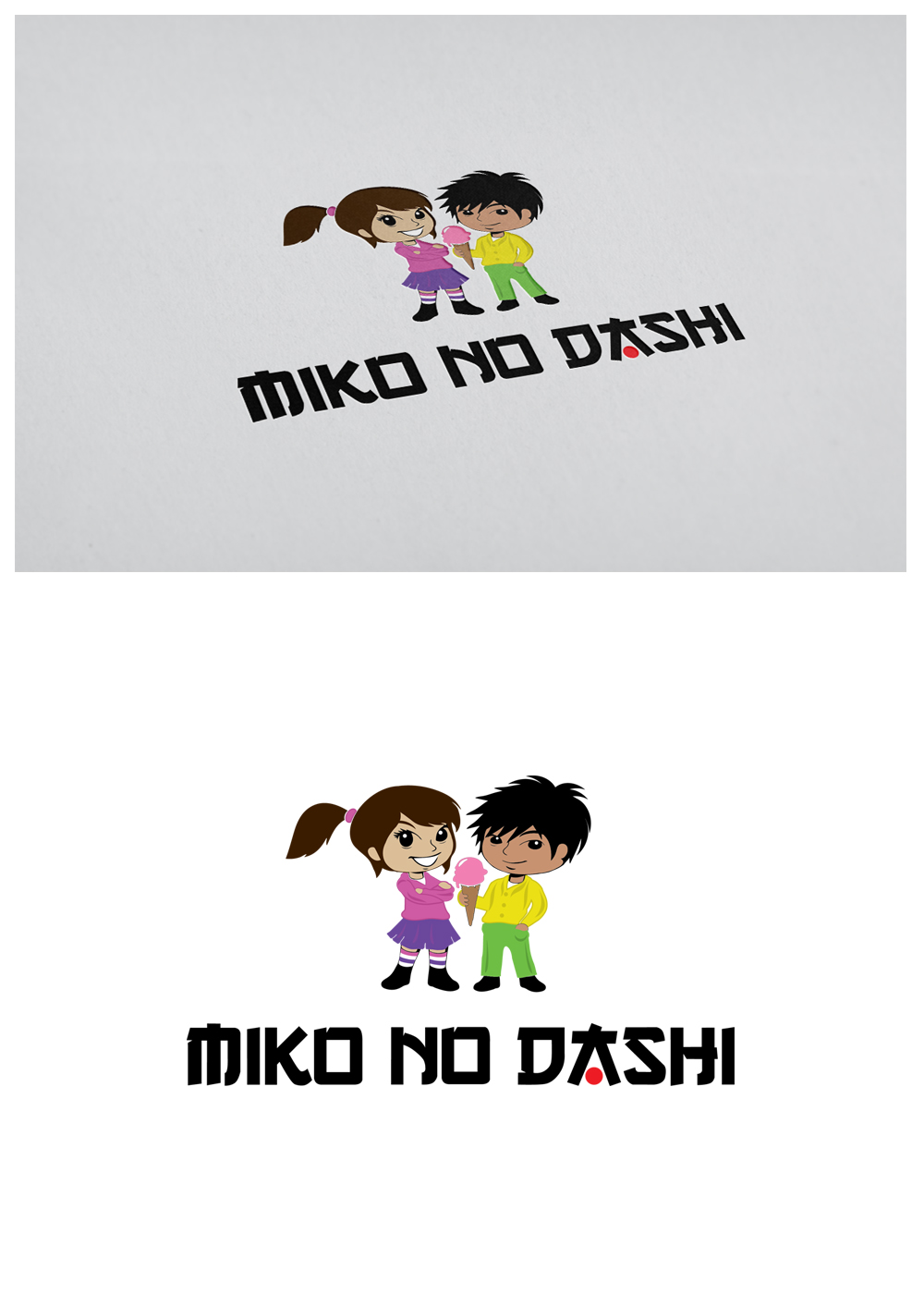
Logo for a cosplay themed dessert shop in the Caribbean called "Miko No Dashi"
Want to win a job like this?
This customer received 26 logo designs from 4 designers. They chose this logo design from goranvisnjic82 as the winning design.
Join for free Find Design Jobs- Guaranteed
-
 US$150
-
 26 designs
-
 4 designers
Logo Design Brief
The task is to create a logo for a company called "Miko No Dashi". Miko No Dashi is cosplay themed dessert shop located in the Caribbean Island of Trinidad and Tobago. The name "Miko No Dashi" is meant to symbolise the children of the owners, with Miko being their fiery excited daughter and Dashi their cool easy going son. Miko No Dashi is a dessert store for youth and families with young children. We have products such as character themed desserts and provide menus and experiences for storytelling based on the adventures of Miko & Dashi. The logo needs to have Japanese look and feel to it, using bright colours attractive to the target market. To the side of the lettering there should be two "chibi" style characters representing "Miko" and "Dashi" (see the image attached as a reference). The words "Miko No Dashi" translate to mean "Miko and Dashi" with the word "no" representing the word "and" in the english language.
Target Market(s)
Teenagers / Youth age 13-25, Couples with children that are ages 4-8, Middle to High Income Bracket, African, Indian and Mixed Ethnicity. People who love creativity and enjoy unique experiences. Persons that love Japanese anime. Those who enjoy cosplay and want a themed japanese experience in a Caribbean Dessert shop
Industry/Entity Type
Restaurant
Logo Text
Miko No Dashi
Logo styles of interest
Character Logo
Logo with illustration or character
Font styles to use
Colors
Designer to choose colors to be used in the design.
Look and feel
Each slider illustrates characteristics of the customer's brand and the style your logo design should communicate.
Elegant
Bold
Playful
Serious
Traditional
Modern
Personable
Professional
Feminine
Masculine
Colorful
Conservative
Economical
Upmarket
Requirements
Must have
- 1. Japanese authenticity in style and lettering
- 2. An attractiveness to children and youth
- 3. Colours that stand out
- 4. Clear font that is easy to read by mass audiences
- 5. An appeal to a culture that has diverse races living in our country (African, Indian, Syrian, Chinese and Caucasians)
- 6. Design of 2 "chibi" characters representing Miko and Dashi
- 7. a reference to desserts eg ice cream
Nice to have
- Bright Colours
Should not have
- The project should not have a design that appeals to only one race (eg the design of the "chibi" characters should not be 2 caucasian characters with blonde, straight hair)