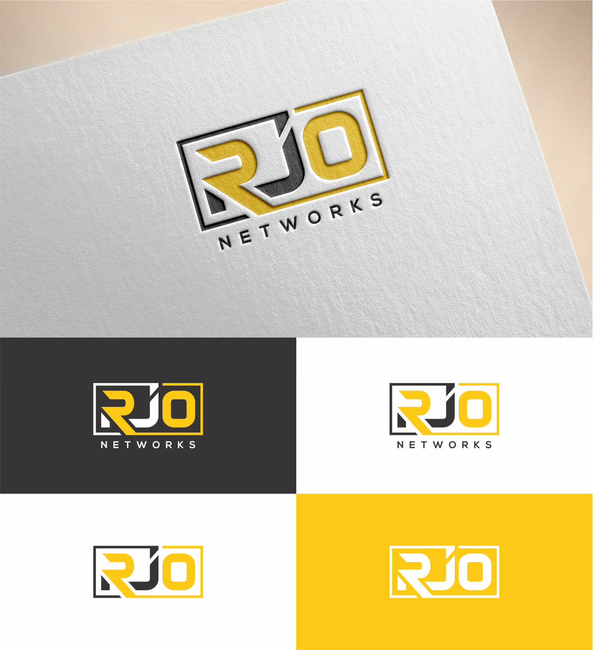
A new logo for our company RJO Networks that utilizes only the 3 letters ‘RJO’
Want to win a job like this?
This customer received 180 logo designs from 69 designers. They chose this logo design from MKR as the winning design.
Join for free Find Design Jobs- Guaranteed
-
 US$150
-
 180 designs
-
 69 designers
Logo Design Brief
Our company RJO Networks has been in business since 2005 and has used the same logo for all these years. We now wish to ‘upgrade’ our logo to include only the ‘RJO’ portion of the company name. Since we are a tech company we want to have a logo with a modern/futuristic feel, in the same vein as the HP, Intel or NASA logos.
These logos include graphics in addition to the actual wording. The logos attached are good examples of where the letters are embedded within a larger graphic. The logo should be able to stand on its own, whether on a webpage or business card; but it should also be designed in a way that we could easily add additional wording in close proximity, such as ‘Networks’, ‘Store’, ‘Technology’, etc.
Target Market(s)
Small and Medium Sized Business
Industry/Entity Type
It Company
Logo Text
RJO
Logo styles of interest
Emblem Logo
Logo enclosed in a shape
Look and feel
Each slider illustrates characteristics of the customer's brand and the style your logo design should communicate.
Elegant
Bold
Playful
Serious
Traditional
Modern
Personable
Professional
Feminine
Masculine
Colorful
Conservative
Economical
Upmarket
Requirements
Must have
- Yellow Gold and Black Colors
Nice to have
- modern/futuristic/technology feeling