Family Business - Letter Based Company Logo
Want to win a job like this?
This customer received 19 logo designs from 4 designers. They chose this logo design from victipedia as the winning design.
Join for free Find Design Jobs- Guaranteed
-
 £100
£100
-
 19 designs
-
 4 designers
Logo Design Brief
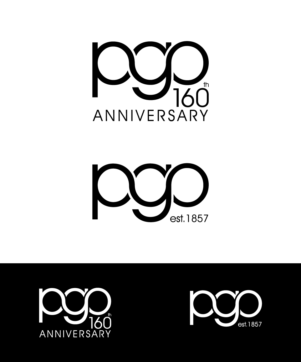
Family Business - 160th anniversary in 2017. A single company with two trading arms; Funeral Directors and Builders specialising in renovations, refurb, etc. This is a family business now with 5th and 6th generation family members working in it and a well-known name in its local UK area. We would like an interlocking style logo as per the supplied demo idea. Ideally in single colour but perhaps with a thin border showing the separation and interlinking of the letters. Short lead time is due to the need to supply a logo to both a printer for local football team shirt sponsorship (no one wants funeral directors as a full name on a kids shirt!) and production of a booklet celebrating the 160th anniversary. More examples of the company name in use at www.pgoxley.co.uk (photos of building vans, etc.)
Industry/Entity Type
Builders
Logo Text
pgo
Logo styles of interest
Lettermark Logo
Acronym or letter based logo (text only)
Font styles to use
Other font styles liked:
- fonts contains simple letter 'g' rather than complex versions
Look and feel
Each slider illustrates characteristics of the customer's brand and the style your logo design should communicate.
Elegant
Bold
Playful
Serious
Traditional
Modern
Personable
Professional
Feminine
Masculine
Colorful
Conservative
Economical
Upmarket
Requirements
Must have
- The 3 main initials of the business P G O only constructing the logo. We believe this is best achieved in lower case lettering but open to alternative ideas. Simple but effective font choice.
Nice to have
- Single colour logo with thin border lines. Landscape style logo orientation. Easily identifiiable lettering styles
Should not have
- No vertical treatments of the layout. No over complex font types.