Logo for Intermittent Blasting
Want to win a job like this?
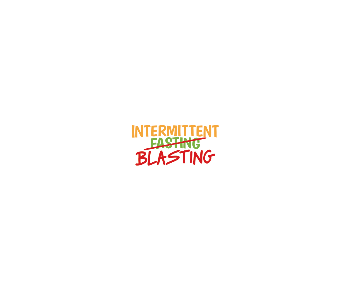
This customer received 71 logo designs from 18 designers. They chose this logo design from Alex C. as the winning design.
Join for free Find Design Jobs-
 US$150
-
 71 designs
-
 18 designers
Logo Design Brief
1. The word "Blasting" should jump off of the page. Anything that helps emphasize this word tastefully is what we aim for.
2. We're always firm proponents of being big, bright, clean, and vibrant. Simple textography that jumps off of a clean background is always the look that we want to opt for. We would like to see some different color layouts encompassing our shades of green, orange, and red. However, you're the artist so we trust your judgment and what you believe looks the best.
3. We would like to see a few examples where Intermittent Fasting/Blasting is positioned vertically. In other words, have the word "Fasting" crossed out and "Blasting" is overlaid, just below, above, or an angle being placed over the word, "Fasting."
4. The phrase, "Intermittent Fasting" should be on two lines. In other words, the word "Intermittent" on one line and the word "Fasting" below it and spaced far enough apart so that Blasting can be superimposed over it
5. The word, "Blasting" should be the same size as "Fasting." Yes, "Blasting" should be more prominent but not excessively as it should imply that the concept "intermittent fasting" so that viewers understand the subject matter but implicitly understand that this is a new way of doing this, i.e. "Blasting" rather than "Fasting".
6. Be creative with how "Blasting" is overlaid on "Fasting." The more options to look at utilizing that beautiful artistic mind of yours; the better.
Updates
Project Deadline Extended
Reason: Not really happy with the designer's submissions. Need more time. Thanks.
Added Monday, June 19, 2017
Logo Text
Intermittent Blasting with Fasting marked out and replaced with Blasting
Look and feel
Each slider illustrates characteristics of the customer's brand and the style your logo design should communicate.