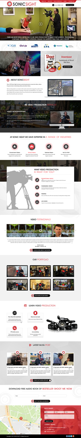
Website layout design UI (not the build)
Want to win a job like this?
This customer received 38 web designs from 13 designers. They chose this web design from Sbss as the winning design.
Join for free Find Design Jobs- Guaranteed
-
 A$230
A$230
-
 38 designs
-
 13 designers
Web Design Brief
Hi there, I need a new website designed and before I start the build I want to get the design sorted. I have wireframes for the layout and an array of pics that will be required for the design.
I am looking for a clean contemporary look.
The site will be built using the Salient wordpress theme.
We are a video production company www.sonicsight.com.au.
The site is designed to enhance our credibility and also drive visitors to a download option (Audio book).
The full brief is in the attached documents, along with pictures, logos, wireframes, sitemaps.
At this point I only need the home page designed. Although I have drafted a wireframe and have included pictures, I'm open to your input to bring this to life and look awesome. Although I'd rather avoid stock images, feel free to make suggestions if need be.
Please read the brief in the attached files before submitting a response.
Thanks Geoff
Target Market(s)
Corporate businesses in Australia
Private Schools
Government departments
Not For Profits
Industry/Entity Type
Build
Number of Pages Required
1 page
Font styles to use
Colors
Colors selected by the customer to be used in the logo design:
Look and feel
Each slider illustrates characteristics of the customer's brand and the style your logo design should communicate.
Elegant
Bold
Playful
Serious
Traditional
Modern
Personable
Professional
Feminine
Masculine
Colorful
Conservative
Economical
Upmarket
Requirements
Must have
- Clean contemporary look. I'm happy to receive feedback on the suggested content if you think it is too text heavy.
- This will be built using the Salient theme.
- Please review the attached design brief. Also use the assets contained in the zipped file. It includes wireframes, site map (for your info), home page content, pics and logos.
Nice to have
- Relevant icons. Our logo (attached) uses red. So some red inclusion in the design would be good, however it doesn't need to overwhelm. Other colours that are used are grey and black. However feel free to use them minimally.
- Refer to www.sonicsight.com.au
Should not have
- Busy, ugly layout.