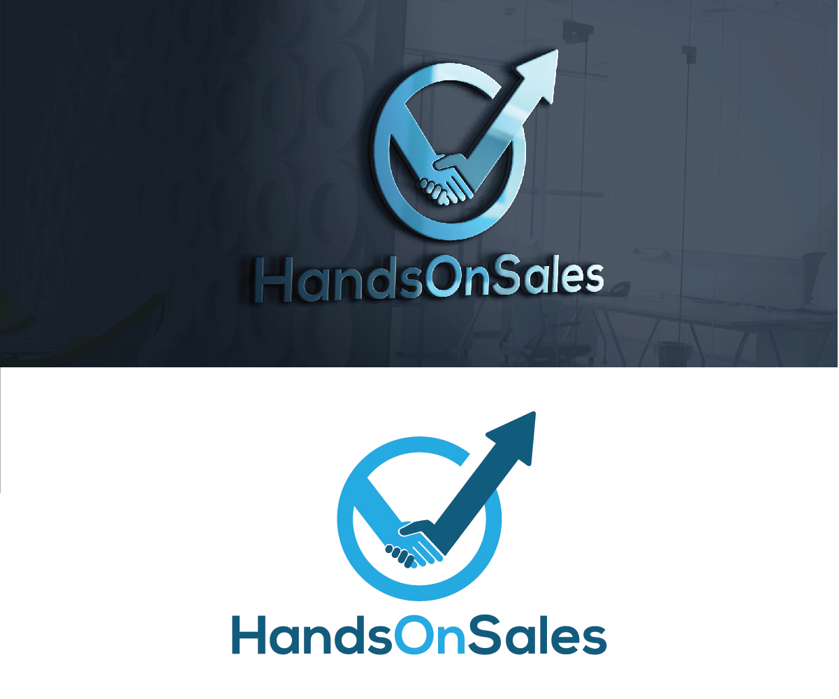
Redo logo design to be more professional

Want to win a job like this?
This customer received 109 logo designs from 43 designers. They chose this logo design from creativemood438 as the winning design.
Join for free Find Design JobsLogo Design Brief
I have had a logo for some years now, but it has to appear more professional. By Professional I mean simpler and more modern, a logo which signals trust. Handsonsales helps B2B companies to improve their results, by working HandsOn the businesss, thats why the original idea with the two hands breaking the curve. I like the logo to show two hands holding a curve, that had a downwards trend and is pushed to new highs by the other. So Improve the graphical quality and make it simpler, perhaps a different frame if any.
Target Market(s)
Business owners and CEO...so High level business men
Industry/Entity Type
It Professional
Logo Text
HandsOnSales
Logo styles of interest
Pictorial/Combination Logo
A real-world object (optional text)
Abstract Logo
Conceptual / symbolic (optional text)
Colors
Designer to choose colors to be used in the design.
Look and feel
Each slider illustrates characteristics of the customer's brand and the style your logo design should communicate.
Elegant
Bold
Playful
Serious
Traditional
Modern
Personable
Professional
Feminine
Masculine
Colorful
Conservative
Economical
Upmarket
Requirements
Must have
- The two hands that change the curve from downwards to going higher that the highest in the past. It needs to be simplistic