Six Peaks Killington - New Ski Village Real Estate Project
Want to win a job like this?
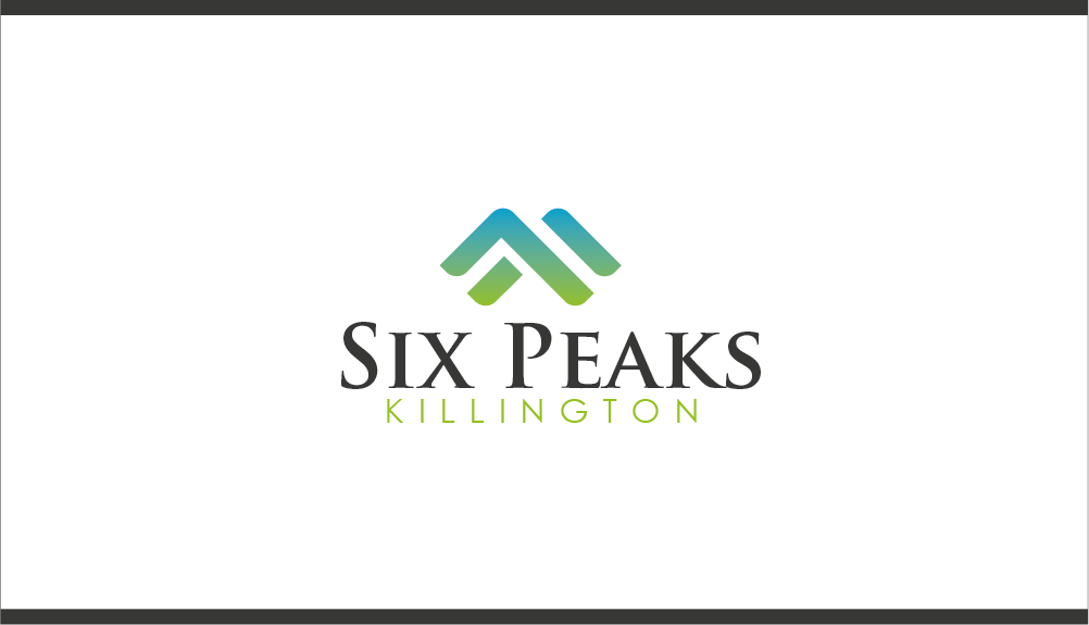
This customer received 327 logo designs from 99 designers. They chose this logo design from Kyle20 as the winning design.
Join for free Find Design Jobs-
 US$520
-
 327 designs
-
 99 designers
Logo Design Brief
Six Peaks Killington is a new village where you can live, eat, shop, ski and golf - at the base of a series of six mountains. It is located at the largest ski resort in the eastern United States – Killington. We need a logo with a mark that represents the 6 peaks in a contemporary, high-end, minimalist look. The name Six Peaks Killington will go beneath it, it can be all on one line or Six Peaks on one line and Killingrton underneath it (your decision). The image we have attached as a reference is the mark for the main Killington Resort. Killington Resort is separate from us, and owned by different owners. But you can see the clean, minimalist, high-end approach that they used (and that they have 3 peaks – white, black and green and the K from the name in it). We want something related to and compatible with this with six mountain peaks and whatever color(s) you prefer. WE DO NOT WANT A COPY OF THE KILLINGTON MARK CLONED AND STACKED ON ITSELF. It needs to be a new, original mark that stands on its own. Be creative but make an obvious tie-in back to the Killington Resort mark in some way.
Target Market(s)
Wealthy skiers that want to live at a new ski village that also has food, shops and events happening during the spring, summer and fall when there is no snow.
Industry/Entity Type
Real Estate Development
Logo Text
Six Peaks Killington
Logo styles of interest
Emblem Logo
Logo enclosed in a shape
Abstract Logo
Conceptual / symbolic (optional text)
Font styles to use
Colors
Designer to choose colors to be used in the design.
Look and feel
Each slider illustrates characteristics of the customer's brand and the style your logo design should communicate.