Logo Design for a Vape Pen brand - SMRTY
Want to win a job like this?
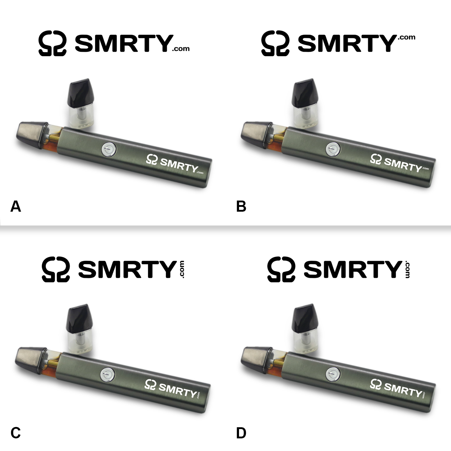
This customer received 81 logo designs from 30 designers. They chose this logo design from Fatboy Graphic as the winning design.
Join for free Find Design Jobs- Guaranteed
-
 C$150
C$150
-
 81 designs
-
 30 designers
Logo Design Brief
SMRTY.com
We need a logo design for a line of Vape pens and juice.
The design of the pen is a little different and uses "vessels" or "pods" rather than a traditional tank.
While the final design needs to be friendly to both male and female users, we want to position our marketing more towards female buyers.
Think Kuerig for vape pens
different vessels from diffrent providers
I was thinking of trying to use the vessels in the logo design
I've included some pictures, but letters inside the tanks, all lined up might look cool (might look really bad too, but ... :) just trying to tye in the product with the brand.
lay it out along the pen and use the pen as a container ...
this is why I need some variety
The business will be selling the vape pens, and selling full vape vessels from various ejuice vendors in a variety of flavors and strengths
including flavored vessels with/without nicotine, cbd, thc
Target Market(s)
18 - 30 year olds, leaning more towards female audience
Industry/Entity Type
Alternative Medicine
Logo Text
SMRTY (.com - maybe)
Logo styles of interest
Emblem Logo
Logo enclosed in a shape
Lettermark Logo
Acronym or letter based logo (text only)
Font styles to use
Other font styles liked:
- http://www.dafont.com/sixties.font | I like this font, but open to others
Colors
Designer to choose colors to be used in the design.
Look and feel
Each slider illustrates characteristics of the customer's brand and the style your logo design should communicate.
Elegant
Bold
Playful
Serious
Traditional
Modern
Personable
Professional
Feminine
Masculine
Colorful
Conservative
Economical
Upmarket
Requirements
Must have
- we're targeting a wide range of customers, it needs to be clean and legible
Nice to have
- A cool, fresh logo that is legible from afar (good on banners and posters)
- Possibly multi-color, or with fonts that are set off kilter/baseline to catch the eye
- I like the peace symbol for some reason with this, maybe as the . in dot com or in the middle of the R - not a requirement ... just like it if it could get worked in.
Should not have
- any direct weed or pot leaf references