Wonderful local community charity needs a new logo
Want to win a job like this?
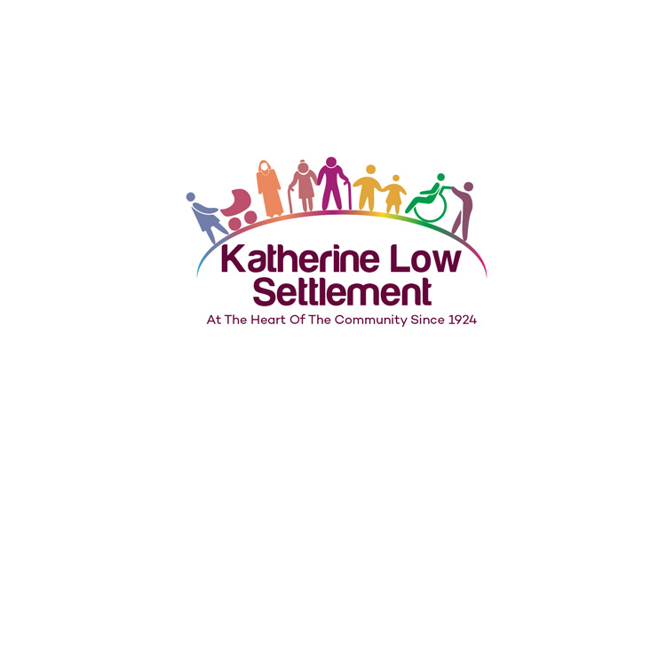
This customer received 193 logo designs from 51 designers. They chose this logo design from DesignDUO as the winning design.
Join for free Find Design Jobs- Guaranteed
-
 £210
£210
-
 193 designs
-
 51 designers
Logo Design Brief
We need a logo design for our wonderful 93 year old charity, the Katherine Low Settlement. We are based in Battersea, London, with over 500 people using our building every week.
Our aim is to 'foster and empower communities to fight poverty and reduce isolation'. Our values are respect, collaboration, sustainability and kindness. Our new strapline is 'At the heart of the community since 1924'.
Our main projects are with older people, teaching English to adults, and educational support for young people from refugee backgrounds. Our building is used by a wide variety of local groups including drama and choirs for people with learning disabilities, zumba, yoga, art and puppy training.
People are at the heart of what we do, and we want anyone to see our logo and feel that this would be an place they would like to come to. We would like to convey collaboration, community, being welcoming, friendship, joy and happiness.
The text needs to be easy to read by people who are learning English. We don't have a font preference. Colours should be bold and vibrant but not primary, and the design should have an organic home-made feel.
Target Market(s)
Members of the local community - people who use our services, local people who we want to come and use our services, supporters of the charity.
Industry/Entity Type
Charity
Logo Text
Katherine Low Settlement
Logo styles of interest
Character Logo
Logo with illustration or character
Colors
Designer to choose colors to be used in the design.
Look and feel
Each slider illustrates characteristics of the customer's brand and the style your logo design should communicate.
Elegant
Bold
Playful
Serious
Traditional
Modern
Personable
Professional
Feminine
Masculine
Colorful
Conservative
Economical
Upmarket
Requirements
Must have
- Images of people in community - a group of diverse people together.
- Vibrant colours, easy to read text. Must be able to incorporate the strapline 'At the heart of the community since 1924'.
- See uploaded images, to give an idea of what we are after.
- Though we are keen to avoid the clip-arty feel in these examples - we'd like the people symbols to be modern and we are keen to have people represented in a recognisable way (e.g. not abstract)
Nice to have
- A circle or arch would be a preferred shape / members of our centre like the concept of an arch / bridge shape 'over' our members, to suggest a protective & supportive environment, as well as signifying the idea of 'building bridges not walls'.
- However - based on the 'should not haves' we would NOT like an actual 'construction' type bridge.
Should not have
- A line drawing of our building with the text in red across it - this is our current logo.
- Buildings / structures of any type
- Gender stereotypes, images of anyone dominating other people, showing people of only one culture.
- We would like to also avoid 'hands' which are often shown in community type logos as these tend to give the impression of a children's centre / family centre and don't convey the full range of services and support we offer.