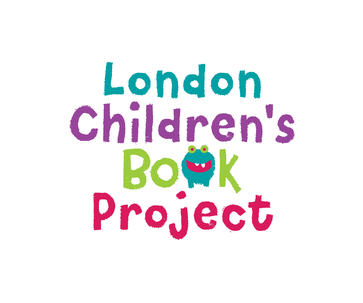
London Children's Book Projecf
Want to win a job like this?
This customer received 78 logo designs from 27 designers. They chose this logo design from elpisk as the winning design.
Join for free Find Design Jobs-
 £110
£110
-
 78 designs
-
 27 designers
Logo Design Brief
Produce a consumer logo for a new service launching this summer.
The Children's Book project will gather new and gently used books from families and schools, will clean and organise them and then will redistribute to children that currently have none. One in four London children has no books at home. Sharing books with an adult opens all sorts of emotional and Learning oriented doors for young people and improves their outcomes. Giving young people access to exciting books will improve their personal outcomes.
Target Market(s)
Young people aged 0-14 primarily though some maybe older
Industry/Entity Type
Consumer
Logo Text
London Children's Book Projecf
Logo styles of interest
Emblem Logo
Logo enclosed in a shape
Pictorial/Combination Logo
A real-world object (optional text)
Abstract Logo
Conceptual / symbolic (optional text)
Font styles to use
Colors
Colors selected by the customer to be used in the logo design:
Look and feel
Each slider illustrates characteristics of the customer's brand and the style your logo design should communicate.
Elegant
Bold
Playful
Serious
Traditional
Modern
Personable
Professional
Feminine
Masculine
Colorful
Conservative
Economical
Upmarket
Requirements
Must have
- A colour logo
- An inviting, warm, accessible logo that evokes inspiration and opportunity that comes from books.
- A logo that evokes a sense of possibility
- A logo that implies this is fun I.e not educational
Nice to have
- I've seen a couple of ideas where books are end to end and like a tower on which a small child stands - sense of fun, exploration and opportunity
- I'd like to emphasise the inspirational aspect of books and how they foster imagination rather than education, learning or betterment
- Any child drawn should be gender neutral
Should not have
- Illustrations of open books, trees or light bulbs are probably too literal
- The logo does not need to reference London