Logo Adjustment for Store-Front Back-Lit Signage
Want to win a job like this?
This customer received 14 signage designs from 4 designers. They chose this signage design from Maestroto as the winning design.
Join for free Find Design Jobs- Guaranteed
-
 US$120
-
 14 designs
-
 4 designers
Signage Design Brief
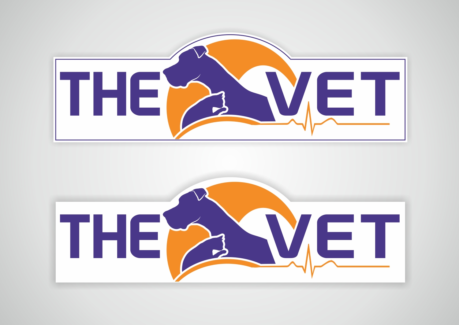
We are a small-animal veterinary clinic (treating dogs and cats only) that has an existing logo (seen on the very top of the "designcrowd_485728..." file) that has been used for two years now for general branding. However, we are in need of a store-front sign that is back-lit to make us official!
The new sign needs to be 10 feet across, with a hump in the exact middle that goes about 38" tall. The measurements are in one of the attachments. PROBLEM: The way the existing logo is currently lined up (with "The" on top right and "Vet" below it, we cannot create a large enough sign to see from the street (i.e. the logo is currently much more square than the very elongated store front signage space that we have.)
Our existing logo is rather square and was created through Design Crowd, as well. The designer had created an elongated mock-up initially for us (the "Mug Version Shutterfly" file), though the logo is very rough and is off-centered to the right with the arch in the "middle". We are aware that the revised signage logo may require some adjustments to look more balanced. Any other adjustments you see fit to improve the design, as long as it meets the measurements will work. The color numbers are as below and attached as well. I can provide more documents or detail on request.
Target Market(s)
Potential new clients driving by our building on a main road (speed limit is approx 45 MPH there).
Industry/Entity Type
Veterinary
Look and feel
Each slider illustrates characteristics of the customer's brand and the style your logo design should communicate.
Elegant
Bold
Playful
Serious
Traditional
Modern
Personable
Professional
Feminine
Masculine
Colorful
Conservative
Economical
Upmarket
Requirements
Must have
- 10 feet long, up to 38 inches tall. Smooth edges. as the sign makers will charge much more if the outline of the sign is irregular aside from the single hump on top. Same font type. Same "pets" on it, though the sizes/shapes overall can vary, as needed (though we prefer the Great Dane head be left proportional as it is). The placement of the cat can be changed entirely if this helps center the artwork more.
- Purple: Hexadecimal 493789; H169, S103, L90; R73, G55, B137
- Orange: Hexadecimal F48D26; H20, S217, L133; R244, G141, B38
Nice to have
- A more centered/balanced look to the logo so that it is not favoring toward the right so much.