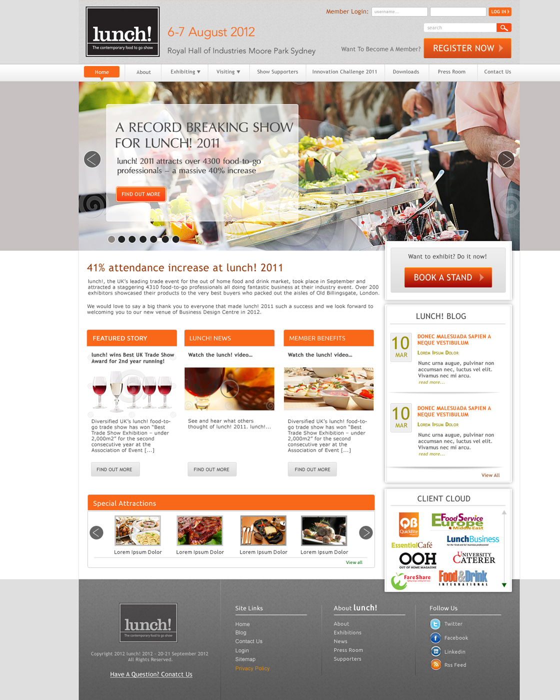
Event website for the Lunch industry
Want to win a job like this?
This customer received 44 web designs from 14 designers. They chose this web design from D...Design as the winning design.
Join for free Find Design Jobs- Guaranteed
-
 A$1000
-
 44 designs
-
 14 designers
Web Design Brief
lunch! is a new show in the Australian market so the website needs to be informative, easy to navigate and clear as to what the event is about and why they should attend – needs to be professional but still fun and dynamic.
Imagery needs to be colourful, fresh, inviting, and should involve a mixture of close up food shots with shots of people interacting.
The event’s competitions are fun and a little quirky (the “Sandwichship” and “Smoothie Competition”), so creative should represent this in tone.
lunch! is a niche and unique show aimed at the multi-million dollar food-to-go market in Australia.
Key selling points for visitors:
- Discover the latest products (food and beverage lines) and equipment to hit the market
- Network with their peers
- Immerse themselves in a range of fun and interactive features – see attached list.
Key selling points for exhibitors:
- Speak directly to decision makers from small – large, food to go related businesses.
- Small niche show, exhibitors have more of an opportunity to stand out/ limited size so good variety of products on display
Some examples of Australian websites which are targeting the same type of customer:
http://www.sandwich.org.au/ - clean/bright/simple
www.finefoodaustralia.com.au – we like the simplicity of the Fine Food website – very clean/colourful.
Updates
Added Friday, December 23, 2011
Target Market(s)
Café/Restaurant owners Sandwich bars/Juice Bars/Bakeries/Delis/Gourmet food stores Pubs/Clubs/Contract Caterers Supermarkets/Food Wholesalers
Industry/Entity Type
Industry
Look and feel
Each slider illustrates characteristics of the customer's brand and the style your logo design should communicate.
Elegant
Bold
Playful
Serious
Traditional
Modern
Personable
Professional
Feminine
Masculine
Colorful
Conservative
Economical
Upmarket
Requirements
Must have
- Main objectives:
1. Visitor Registration – call to action to "Register Now" needs to be very prominent on the home page and on the pages throughout the website
2. Information on exhibiting "Want to Exhibit" – needs to be clearly available.
3. Being a new show, data capture is important, so this needs to feature on the home page.
4. Social Media share buttons
5. Floating CSS Nav bar (top or bottom) with key call to actions - Register, Want to exhibit?, sign up
I would like all designs to have both a home page and a content page submitted.
Should not have
- Lunch UK show website: www.lunchshow.co.uk
- We will be using the same branding as the UK lunch show website but we don’t like how busy their website is (too many blocks of run on text and too many navigation tiles on the home page). We would prefer to take a more simplified approach – ie. hero images (JQuery) dominating the screen, with a really strong CTA to register and to find out more about exhibiting.