"Rhodium", a VoIP application needs a logo design
Want to win a job like this?
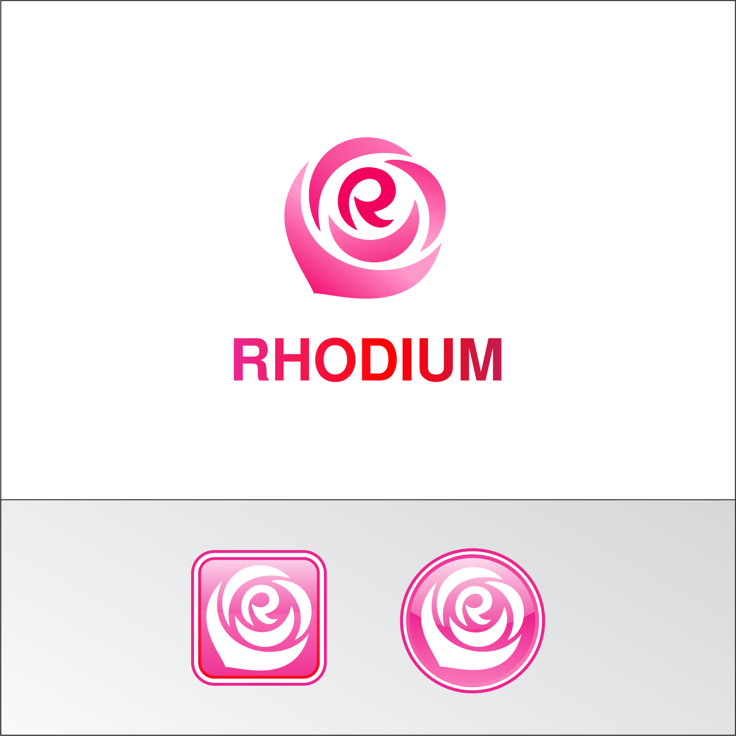
This customer received 317 logo designs from 108 designers. They chose this logo design from Joe Seph as the winning design.
Join for free Find Design Jobs- Guaranteed
-
 US$300
-
 317 designs
-
 108 designers
Logo Design Brief
We need a logo design for a VoIP application named "Rhodium". Rhodium works as a combination of appliance and smartphone application and it is targeted to small to medium businesses. While the logo will be put both on appliance and on smartphone application, some emphasis is put on that the logo mark being an application icon. Rhodium is a chemical element with atomic number 45. It's named Rhodium because one of its chlorine compounds shows rosy color. Thus we want the logo color to be "rosy-red"-ish. The logo may include some image to suggest rose flower but not mandatory. Messages we want to deliver with the logo are; "friendly", "ease of use", "reliable".
Updates
Initially, we thought the rose is "nice to have". However, now we have so many good designs with rose, thus it is now "must have". We don't think we end up choosing a design without rose.
Added Sunday, February 5, 2017
Target Market(s)
Small to Medium Businesses. The industry is a little bit conservative and the average age a bit higher thus prefer "friendly" than "super-cool".
Industry/Entity Type
Telecommunications
Logo Text
Rhodium
Logo styles of interest
Abstract Logo
Conceptual / symbolic (optional text)
Wordmark Logo
Word or name based logo (text only)
Font styles to use
Colors
Colors selected by the customer to be used in the logo design:
Look and feel
Each slider illustrates characteristics of the customer's brand and the style your logo design should communicate.
Elegant
Bold
Playful
Serious
Traditional
Modern
Personable
Professional
Feminine
Masculine
Colorful
Conservative
Economical
Upmarket
Requirements
Must have
- "Rhodium" wordmark logo and logo mark which is usable for smartphone icon.
Nice to have
- The logo that reminds "rose", or even explicitly showing "rose" somewhere may be nice but just a non-designer idea and you can completely ignore this.
- Many people relate rose with the letter "O" of "rhOdium", however, I'd want to see more idea relating the rose with "R", the initial letter. It is particularly nice when used as a smartphone icon.
- You can also ignore the color I chose below.