Harvest Foods & Co Logo Design
Want to win a job like this?
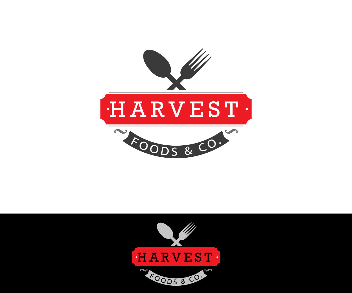
This customer received 117 logo designs from 44 designers. They chose this logo design from sonym as the winning design.
Join for free Find Design Jobs-
 C$270
C$270
-
 117 designs
-
 44 designers
Logo Design Brief
We need a logo design for the opening of much needed store serving coffee, baked goods and prepared foods. This location will have no seating and will be a grab and go concept. Foods and ingredients will be seasonal with most items all hand crafted and consciously prepared in house.
The name Harvest Foods & Co was established based on the feel of locally grown / sourced items, lovingly prepared onsite with the help of family and friends all within the community.
The logo must tie into our values of carefully, hand- crafted ingredients locally sourced and grown, seasonal products from our store to your table with our personal touch. It's a quaint community with both young and older, retired demographics and have a desire to see these prepared items available to bring home with them.
To give you an idea of the store look and feel, think of a farm or barn. Recycled / Re-Used Pine wood on outside of the store all stained in natural colours with light black around the doors and windows creating a rich, warm, inviting and authentic harvest feel. Inside the store is light in colour with light grey / blue walls, white high ceiling, Re-Used pine boards and cabinets also stained with prepared jams, sauces and other items. The goal is to have it look like an updated country cottage home with the bones of the building in place but new colours to refresh the look.
The logo should be both rich in font and colours while still keeping the authentic look and feel of a Country Inn with a nice touch of sophistication. This logo will appear in our main window which is approximately 10' x 5'.
Target Market(s)
Middle Upper income and retired demographic. It's a quaint small community with young families and those that have retired. very old community
Industry/Entity Type
Food Store
Logo Text
Harvest Foods & Co.
Logo styles of interest
Wordmark Logo
Word or name based logo (text only)
Font styles to use
Look and feel
Each slider illustrates characteristics of the customer's brand and the style your logo design should communicate.
Elegant
Bold
Playful
Serious
Traditional
Modern
Personable
Professional
Feminine
Masculine
Colorful
Conservative
Economical
Upmarket
Requirements
Must have
- The logo should be both rich in font and colours while still keeping the authentic look and feel of a Country Inn with a nice touch of sophistication. This logo will appear in our main window which is approximately 10' x 5'.
Nice to have
- maybe an emblem to pull together the Wordmark logo. Undecided
Should not have
- Please stay away from bright colours. Colours to reflect heritage, rich, warm and sophisticated