Design workmark for start-up construction company in Seattle
Want to win a job like this?
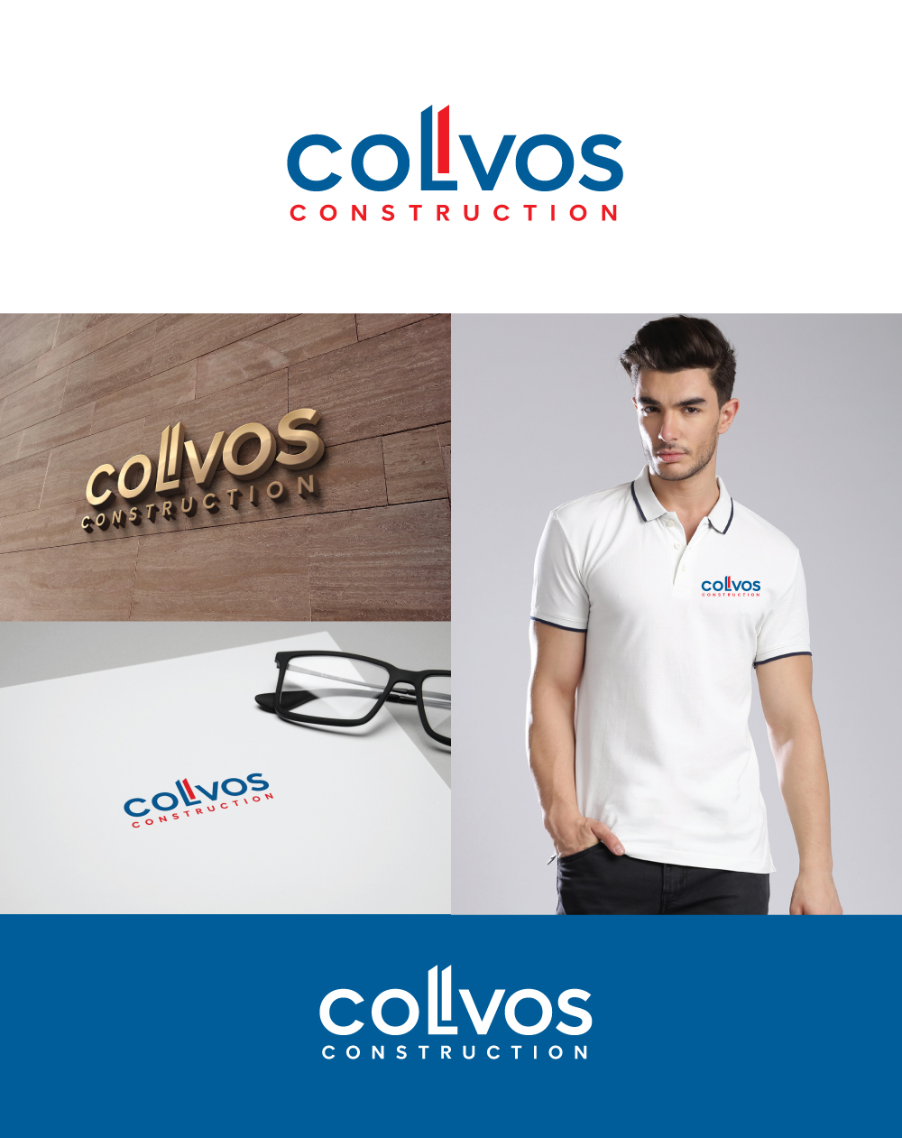
This customer received 224 logo designs from 61 designers. They chose this logo design from ESolz Technologies as the winning design.
Join for free Find Design Jobs-
 US$150
-
 224 designs
-
 61 designers
Logo Design Brief
We need a wordmark for a commercial construction company located in Seattle, WA called Colvos Construction. The company is named after the Colvos Passage in Puget Sound. These waters are very important to our brand story. Our colors were chosen from the deep tones of the water contrasted against the brilliance of the winter sunrise reflecting off the ever-present clouds.
Our brand colors are Pantone 301 and 2347. The blue should be the dominate color, with the red/orange for pop/accent only.
The mark should demonstrate strength and be bold, but not trendy. It should express timelessness and feel established. Our industry is primarily masculine, but we want our logo to be gender neutral.
The final design should be clean and devoid of layers. It should read well in all uses, from digital to print to screen. The mark could be stripped into an icon of the letter "c" or double "c". The mark should be more rectangular than vertical.
Target Market(s)
Real estate developers, property owners, architects, candidate recruits.
Industry/Entity Type
Construction
Logo Text
Colvos Construction
Logo styles of interest
Wordmark Logo
Word or name based logo (text only)
Look and feel
Each slider illustrates characteristics of the customer's brand and the style your logo design should communicate.
Elegant
Bold
Playful
Serious
Traditional
Modern
Personable
Professional
Feminine
Masculine
Colorful
Conservative
Economical
Upmarket
Requirements
Must have
- Wordmark, not graphic logo. Must use Pantone 301 and 2347, with 301 as the dominate color.
Should not have
- Icons