Creating Sales/Traction for Early Stage Startups, B2B
Want to win a job like this?
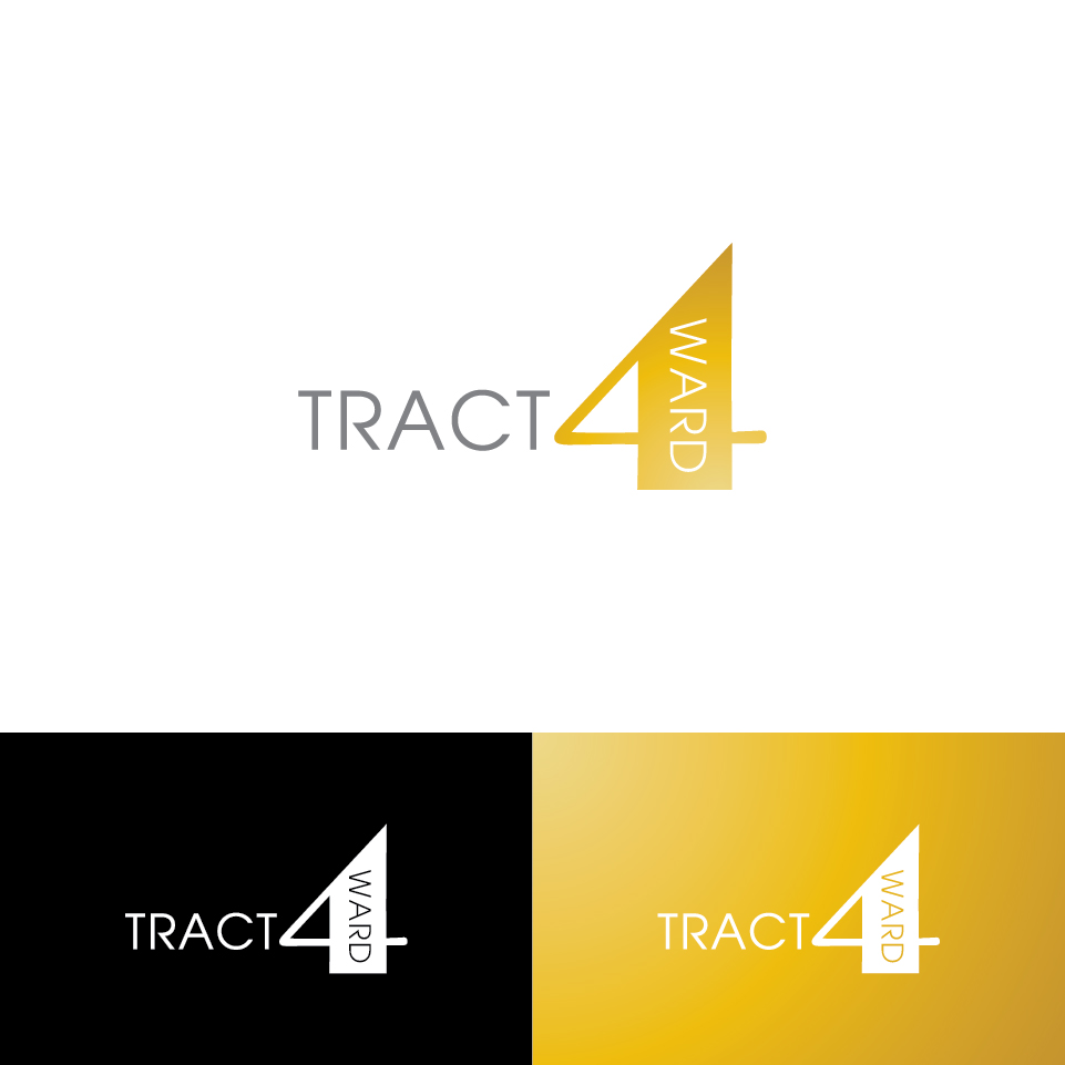
This customer received 176 logo designs from 42 designers. They chose this logo design from creativevis as the winning design.
Join for free Find Design Jobs- Guaranteed
-
 US$150
-
 176 designs
-
 42 designers
Logo Design Brief
Alert!!! New business name! Iron Revenue
Iron Revenue
is going to be the essential sales team for the company to move forward.
Tract(ion) traction is the moment startups require to prove to investors that they have a viable product
Startups needs to produce evidence that there is a market for their product.
Investors want to know that there is a repeatable sales model.
Most founders of startups are not sales people and so tract4ward provides sales, sales team development and proof of concept.
Updates
Project Deadline Extended
Reason: I spoke with design crowd and they said that they were going to extend it. I said good but I guess it hasn't been extended. Now I only have a few more days. Please, let's create something!
Added Thursday, December 15, 2016
Target Market(s)
US
Industry/Entity Type
Startup
Logo Text
Iron Revenue
Logo styles of interest
Emblem Logo
Logo enclosed in a shape
Pictorial/Combination Logo
A real-world object (optional text)
Abstract Logo
Conceptual / symbolic (optional text)
Font styles to use
Colors
Colors selected by the customer to be used in the logo design:
Look and feel
Each slider illustrates characteristics of the customer's brand and the style your logo design should communicate.
Elegant
Bold
Playful
Serious
Traditional
Modern
Personable
Professional
Feminine
Masculine
Colorful
Conservative
Economical
Upmarket
Requirements
Must have
- A separate stand-alone logo from the name.
Nice to have
- Is it possible to have iron and not have it look like a skateboard company? That would be the goal. I saw a few corporate logos that had an iron fist or a anvil or crest. Maybe using a dollar sign cleverly. It might be interesting to have the iron worker man standing over the anvil to be clearly a woman..as I am a woman.
- But then it might be too confusing. You decide.
- It could also be mostly gray scale with a tiny tint of color.
Should not have
- No black and red together. Last company logo was black and red.
- Should not have a pig in the logo but the image below...I like the simplicity.