Time to breath new life to tired old logo
Want to win a job like this?
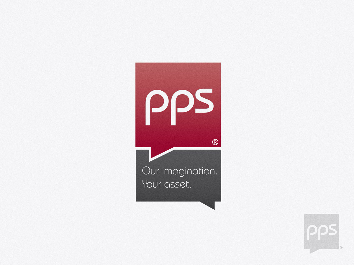
This customer received 43 logo designs from 13 designers. They chose this logo design from Lewis as the winning design.
Join for free Find Design Jobs-
 US$320
-
 43 designs
-
 13 designers
Logo Design Brief
This twenty something company deal strictly in the pharmacy industry. It has a new owner, me, and I need to clean house so to speak. I want to completely rebrand it and the first thing I need is a new logo for one of its brand; PPS(R).
The web site is www.ppspharma.com. The company is actually called Total Pricing Systems Inc. but it is known throughout Canada as "PPS Pharma" or simply as "PPS". PPS(R) are a series of services and not an actual product per se. We produce a large catalogue that is distributed twice a year to over 10,000 pharmacists across Canada on behalf of the large pharmaceutical drug manufacturers.
***DO NOT...***
-include the word "PHARMA" in the logo as shown on my web
-make it an obvious pharmaceutical logo such as adding a pill, or medical symbols, etc...
***YOU CAN...***
-include other graphics with the three letters such as combination pictorial or abstract logos below
The logo MUST be able to be converted into pure black and white. This means that you must use gradients and shades very carefully. Our industry uses fax services extensively and my logo appears on every single page and to ensure it transmits well. This does not mean you cannot use gradient or shade (although I would highly recommend that you don't) but if the design depends on this, I will most likely have to eliminate it.
It must be better looking; more upscale and up-to-date than my competitors. They are
www.ptm-health.com,
www.medcommunications.ca,
www.smartsti.com (not bad looking),
www.healthresponse.ca.
It must be dark red or burgundy in colour.
Updates
Hi Everyone,
Added Monday, December 05, 2011
Target Market(s)
Pharmaceutical companies (very large) and pharmacists (very small)
Industry/Entity Type
Pharmaceutical
Logo Text
It must the three letters "PPS" with the Registered symbol on the bottom right
Logo styles of interest
Emblem Logo
Logo enclosed in a shape
Pictorial/Combination Logo
A real-world object (optional text)
Abstract Logo
Conceptual / symbolic (optional text)
Lettermark Logo
Acronym or letter based logo (text only)
Look and feel
Each slider illustrates characteristics of the customer's brand and the style your logo design should communicate.
Elegant
Bold
Playful
Serious
Traditional
Modern
Personable
Professional
Feminine
Masculine
Colorful
Conservative
Economical
Upmarket
Requirements
Must have
- -It must have the three letters PPS but DO NOT INCLUDE the "PHARMA" as per the web site logo.
-It must be able to be converted perfectly to pure black and white (not gray-scale, see brief)
Should not have
- -No medical diagrams such as a red or blue cross
-No medical diagrams such as the two serpents etc.
-Not obvious that it is on the pharmaceutical industry such as pills