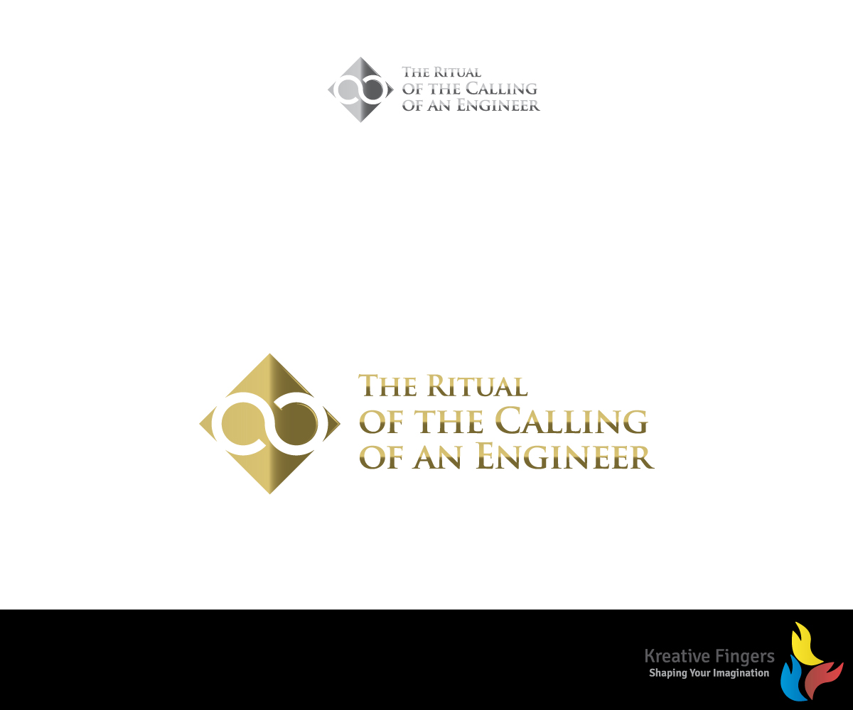
A non-profit organization with a 94 year tradition needs a logo.

Want to win a job like this?
This customer received 57 logo designs from 25 designers. They chose this logo design from Kreative Fingers as the winning design.
Join for free Find Design Jobs- Guaranteed
Logo Design Brief
The Corporation of the Seven Wardens manages the oath and obligation that all graduating engineers in Canada take, as well as the distribution of the iron ring that all graduates wear on the little finger (pinky) of the working hand. The Corporation was started in 1922 by seven senior Canadian engineers, who wanted Canadian engineering graduates to become part of an honoured and respected fellowship. The oath taken is similar to that taken by graduating doctors, except that our oath involves the ideals of using the best materials, of helping out fellow engineers, of never allowing poor workmanship to pass, and of protecting the public. The iron ring is a multi-faceted stainless steel ring, the design of which is copyright protected.I do not want the actual ring in the logo; rather, I wish to have the logo communicate trust, tradition, and the highest standards. Perhaps some gold colour.....perhaps the integration of an infinity symbol and rings.....
See www.ironring.ca
Target Market(s)
The logo will be used on Corporation correspondence, certificates and functions. It is for both internal and external use.
Industry/Entity Type
Non-Profit
Logo Text
The Ritual of the Calling of an Engineer
Logo styles of interest
Abstract Logo
Conceptual / symbolic (optional text)
Font styles to use
Look and feel
Each slider illustrates characteristics of the customer's brand and the style your logo design should communicate.
Elegant
Bold
Playful
Serious
Traditional
Modern
Personable
Professional
Feminine
Masculine
Colorful
Conservative
Economical
Upmarket
Requirements
Must have
- A look and feel of tradition, trust and quality.
Nice to have
- Some gold colouring
Should not have
- The actual iron ring image cannot be used at all.