Quick Logo Update: KSA Logo Update
Want to win a job like this?
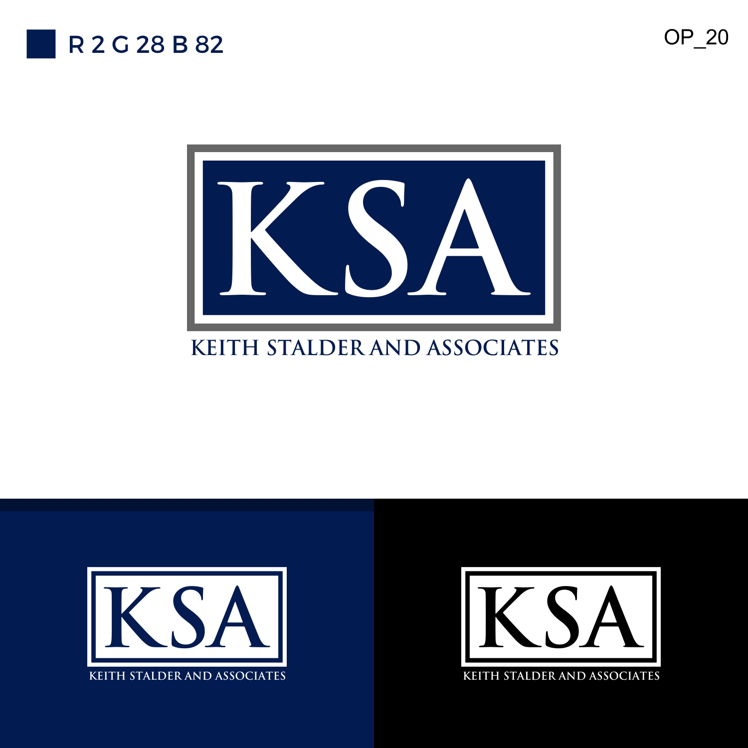
This customer received 29 logo designs from 3 designers. They chose this logo design from White sky as the winning design.
Join for free Find Design Jobs-
 US$150
-
 29 designs
-
 3 designers
Logo Design Brief
We are doing a refresh to our logo, because we have had some difficulty with printing and business cards.
1. We like the dual border around the rectangle: grey, white, and navy are strong, clean colors. Our previous color scheme would print as purple, so we need a blue/navy that will print as blue/navy.
2. We prefer a font with serif, but not so much that the letters bleed together. The letters must be distinct from one another, in this instance. Palatino Linotype or Goudy Old Style translated well when we tried them.
3. No recognizable fonts, like Calibri or Comic.
4. It should be clean, refined. We aren't looking for edginess, we are consulting professionals so it should reflect this.
5. We need one version in Black and White (or Grayscale), one in color with a white background, one in color with a black background, and one with "Keith Stalder and Associates" printed clearly beneath the logo.
6. We need high resolution JPG files for each.
Industry/Entity Type
Government
Logo Text
KSA
Logo styles of interest
Wordmark Logo
Word or name based logo (text only)
Lettermark Logo
Acronym or letter based logo (text only)
Font styles to use
Look and feel
Each slider illustrates characteristics of the customer's brand and the style your logo design should communicate.
Elegant
Bold
Playful
Serious
Traditional
Modern
Personable
Professional
Feminine
Masculine
Colorful
Conservative
Economical
Upmarket
Requirements
Must have
- We are doing a refresh to our logo, because we have had some difficulty with printing and business cards.
- 1. We like the dual border around the rectangle: grey, white, and navy are strong, clean colors. Our previous color scheme would print as purple, so we need a blue/navy that will print as blue/navy.
- 2. We prefer a font with serif, but not so much that the letters bleed together. The letters must be distinct from one another, in this instance. Palatino Linotype or Goudy Old Style translated well when we tried them.
- 3. No recognizable fonts, like Calibri or Comic.
- 4. It should be clean, refined. We aren't looking for edginess, we are consulting professionals so it should reflect this.
- 5. We need one version in Black and White (or Grayscale), one in color with a white background, one in color with a black background, and one with "Keith Stalder and Associates" printed clearly beneath the logo.
- 6. We need high resolution JPG files for each.
Nice to have
- We are doing a refresh to our logo, because we have had some difficulty with printing and business cards.
- 1. We like the dual border around the rectangle: grey, white, and navy are strong, clean colors. Our previous color scheme would print as purple, so we need a blue/navy that will print as blue/navy.
- 2. We prefer a font with serif, but not so much that the letters bleed together. The letters must be distinct from one another, in this instance. Palatino Linotype or Goudy Old Style translated well when we tried them.
- 3. No recognizable fonts, like Calibri or Comic.
- 4. It should be clean, refined. We aren't looking for edginess, we are consulting professionals so it should reflect this.
- 5. We need one version in Black and White (or Grayscale), one in color with a white background, one in color with a black background, and one with "Keith Stalder and Associates" printed clearly beneath the logo.
- 6. We need high resolution JPG files for each.
Should not have
- We are doing a refresh to our logo, because we have had some difficulty with printing and business cards.
- 1. We like the dual border around the rectangle: grey, white, and navy are strong, clean colors. Our previous color scheme would print as purple, so we need a blue/navy that will print as blue/navy.
- 2. We prefer a font with serif, but not so much that the letters bleed together. The letters must be distinct from one another, in this instance. Palatino Linotype or Goudy Old Style translated well when we tried them.
- 3. No recognizable fonts, like Calibri or Comic.
- 4. It should be clean, refined. We aren't looking for edginess, we are consulting professionals so it should reflect this.
- 5. We need one version in Black and White (or Grayscale), one in color with a white background, one in color with a black background, and one with "Keith Stalder and Associates" printed clearly beneath the logo.
- 6. We need high resolution JPG files for each.