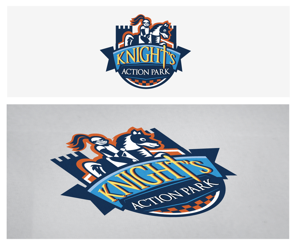
Knight's Action Park Logo
Want to win a job like this?
This customer received 61 logo designs from 19 designers. They chose this logo design from Frontino graphic studio as the winning design.
Join for free Find Design Jobs- Guaranteed
-
 US$200
-
 61 designs
-
 19 designers
Logo Design Brief
We need a logo redesign for Knight's Action Park, located in Springfield, IL. Visit their website at http://www.knightsactionpark.com/ to see their old logo and and website. It is very outdated and looks like clip art. We need to bring them to the 21st century. After the logo design, we will be redesigning their website as well so don't use any of this design as direction. However, this project is just for the Logo.
Company Info:
Knight’s Action Park provides guests with a beautiful, natural setting as well as plenty of fun & excitement with entertainment for all ages. The thrill of the Devil Ray water slide, the crashing splashes of the Bumper Boats, or a leisurely trip aboard the Pedal Boats across the wide lake all provide amusement options for every age. Offering sheltered picnic pavilions, catering menus with delicious food choices, and a group services staff to assist in anyway necessary, Knight’s Action Park makes certain every family or group outing is a delightful experience for everyone.
Park offers:
Waterpark
Batting cages
Golf Driving Range
Miniature Golf
Go Kart Ride
Batting Cages
Ferris Wheel
Video Game Room
Drive-in Theater
Design direction
Fun, Kid-friendly, Family-oriented
Bright colors, happy, relatable, energy, action
Logo should be all encompassing of the Action Park and display the energy and excitement of all it has to offer.
Updates
For some design direction. How about something like one of these 2 logos.
Added Wednesday, September 25, 2013
Project Deadline Extended
Added Friday, September 27, 2013
Thank you to all designers who participated in this project! We got some great designs in and I appreciate everyone who submitted.
Added Thursday, October 10, 2013
Target Market(s)
Primary Demo
Midwest, small town, conservative
Families
Adults 25-54 with kids ages 8 to highschool
Low-mid income level household
Logo Text
Knight's Action Park
Look and feel
Each slider illustrates characteristics of the customer's brand and the style your logo design should communicate.
Elegant
Bold
Playful
Serious
Traditional
Modern
Personable
Professional
Feminine
Masculine
Colorful
Conservative
Economical
Upmarket
Requirements
Must have
- Client is very attached to the Knights theme and would like to keep this in the logo. Incorporate a knight and/or knight on horse
Should not have
- They DO NOT like a dark, "Medieval Times" look