eye catching frozen pies package
Want to win a job like this?
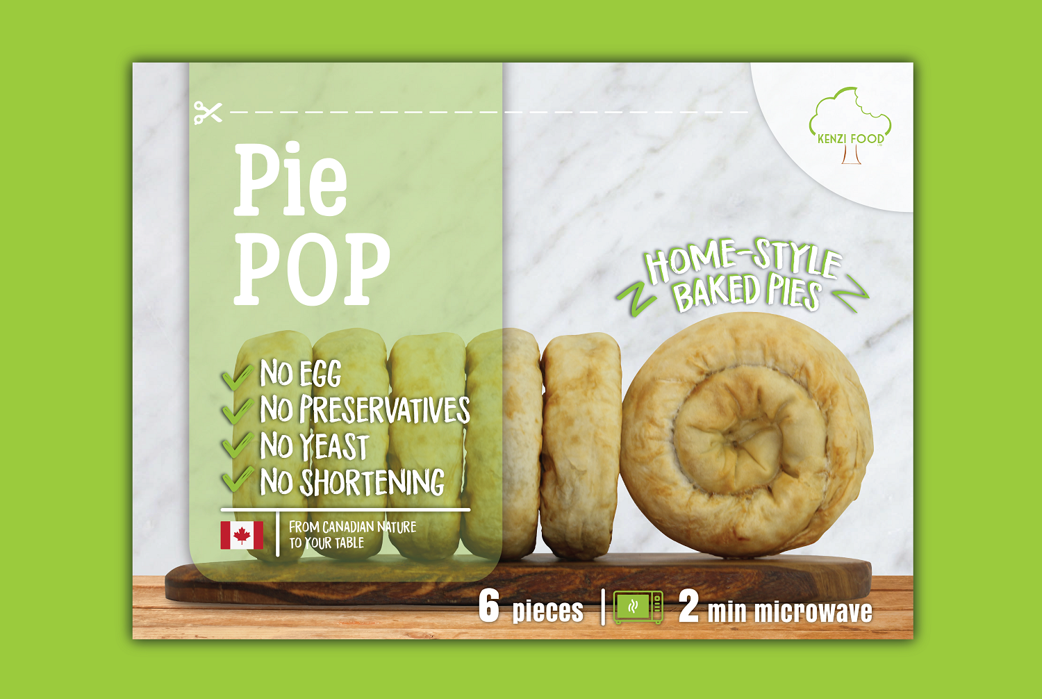
This customer received 32 packaging designs from 7 designers. They chose this packaging design from Iwana Ioana as the winning design.
Join for free Find Design Jobs- Guaranteed
-
 C$281
C$281
-
 32 designs
-
 7 designers
Packaging Design Brief
We are looking for package design for our new product “Pie POP”, we are food production start-up based in west Canada 'Kenzi Food'. Our product it is basically a healthy and natural type of pie that we are willing to retail it in local groceries.
We are mainly marketing the Pie POP being far better healthy choice for traditional pies, as our product has no yeast or baking additives, has no oil, no eggs, and it’s baked.
Pie POP has Mediterranean origins but we had tweaked it to fit the Canadian consumers, and that's one of the product main strong marketing points. Pie POP comes in 3 types (Beef, Veggie, and Cheese).
We have picked Block Bottom Stand up Pouch as package (see attachment 09-13) with both sides made of semi-transparent material (matte), bag size is (attachment 08) Width 230 mm x Length 170 x Bottom gusset 100 mm. Each bag will contain 6 pieces of Pie POP (net weight 540 gr), stacked like a cylinder/tube. the reason why we choose this bag because we wanted the pack to look like a box while it is simple bag only, and that's why we need the art design of the back to reflect the simple product in a very attractive/eye catching concept. The bag front will face the consumer when it is inside the display freezers and to grab their eyes by its shape, thus the design on the bag shall get use of the bag shape and exposure.
Note: all product photos are in JPG format but RAW/PDF are available for the final design stage, and all photos need some Photoshop for colour/light correction (design is responsible to create the best photo file)
Target Market(s)
Pie POP is ready to eat and our customers are young working couples/moms, kids lunch boxes, and healthy lite meals seekers. We believe that Pie POP is a very new product in our market and there is no directly similar product.
Industry/Entity Type
Product
Font styles to use
Colors
Colors selected by the customer to be used in the logo design:
Look and feel
Each slider illustrates characteristics of the customer's brand and the style your logo design should communicate.
Elegant
Bold
Playful
Serious
Traditional
Modern
Personable
Professional
Feminine
Masculine
Colorful
Conservative
Economical
Upmarket
Requirements
Must have
- Deliverable:
- • Stand up pouch overall design
- • Product name label design
- • Back side label design (nutrition facts and ingredients)
- Front of pack:
- • Brand name: Pie POP
- • Common Name: Home-style Baked Pies
- • Product name: red for BEEF, green for VEGGIE, yellow for CHEESE (circular sticker/label to identify which type of pie pop with unique colour for each type)
- • From Canadian nature to your table (with Canadian maple leaf logo)
- • No egg, No Shortening, No yeast, No Preservatives.
- • Photo and art works
- • 6 pieces
- • Cooking instruction: 2 min microwave (graphical representation)
- Back of pack:
- • Portion of the back shall be left blank to receive white sticker/label that contains
- o Nutrition facts: use attached table (will be shared later)
- o Ingredients: see attachment A
- o Allergies : contains wheat, dairy, sesame seeds, soy sauce
- o Net Weight: 560 g
- o Best before: (leave empty space for stamp)
- o Contacts: Kenzi Food Ltd., T6X 1N6, AB, Canada
- o Kenzi Food logo: see attachment B
- o 587 596 5324 – kenzifoodservices@gmail.com
Nice to have
- Design style:
- We prefer modern to contemprory design style with range of colors similar to the attached (lime green, white, light grey) but it is up to the designer to suggest any other styles or/and colors, as we are strongly open to new ideas.
Should not have
- design should not use any of the attached bags photo designs (attachments 08-13)