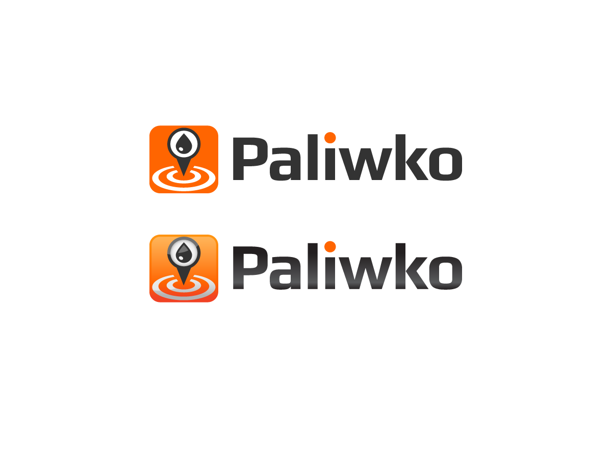
Mobile gas price comparison app

Want to win a job like this?
This customer received 108 logo designs from 31 designers. They chose this logo design from 96 alex as the winning design.
Join for free Find Design JobsLogo Design Brief
Hi guys,
I am writing an app for iOS and Android that lets you real-time compare gas/petrol price on each and every gas station on you mobile phone and I need a logo for that. The logo will be used throughout the app and in App Store and Google Play, so I would a logo that we could easily transform into an icon.
The company is technology focused but caters to tradtitional business as cars and petrol.
Target Market(s)
The broad target are all the drivers, but it will be mostly people who want to save some money on petrol. So it will be people in the age of 20-40, mostly men as I wrote before. It won't be directed towards rich people, mostly middle class.
Logo Text
paliwko (can be either capital or small letter, as well as 'P' is capital and the rest is small)
Logo styles of interest
Pictorial/Combination Logo
A real-world object (optional text)
Abstract Logo
Conceptual / symbolic (optional text)
Wordmark Logo
Word or name based logo (text only)
Look and feel
Each slider illustrates characteristics of the customer's brand and the style your logo design should communicate.
Elegant
Bold
Playful
Serious
Traditional
Modern
Personable
Professional
Feminine
Masculine
Colorful
Conservative
Economical
Upmarket
Requirements
Must have
- We need to be able to meet following criteria set by Android and iOS. The icon (so no necessarily the logo, but the icon we would derive from it) need to look good in following sizes: 36 x 36, 48 x 48, 72 x 72, 96 x 96, 144 x 144, 512 x 512 (this is for Android) and 1024 x 1024 and 14x114 i 57x57 (for iOS).
- As for the whole logo, the only thing that is must, it needs to relate to the purpose of the app, I mean be connected somehow with filling up, petrol etc.
- Also, bear in mind, that the target of our company are mostly men, so it cant be too delicate.
Nice to have
- The app is mostly in orange (RGB: 255, 101, 1) but has also lots of light and a bit darker grey in it. So I would just want it to be in line with the colours we use in the app. It don't need to be the same colours. What's more, I will probably use the logo also in other settings so it would be good if it would be kind of 'transferable into other colours'.