Safety Train - NZ's newest training provider is in need of a logo!
Want to win a job like this?
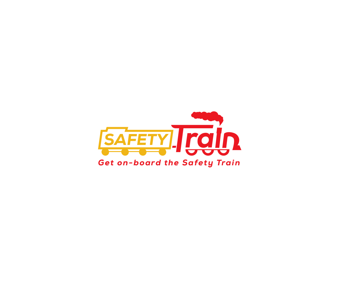
This customer received 33 logo designs from 13 designers. They chose this logo design from Maher Sh as the winning design.
Join for free Find Design Jobs-
 NZ$160
-
 33 designs
-
 13 designers
Logo Design Brief
Safety Train is a new training provider based in New Zealand helping build awareness and education for people that come in to contact with Asbestos and other hazardous substances as part of their work. Our tagline is "Get on-board the Safety Train" and we also talk about "Making training the first step in your safety journey". The final design we are looking for should incorporate the physical idea of an actual Train. So in other the word train is used to illustrate an image of an actual train - the T is the cab and the i is the chimney with smoke coming out of it. In terms of colours we are looking for something bright and engaging and inline with Safety - Yellow, Red or Green.
Target Market(s)
Anyone who may come into contact with asbestos such as: general builders, electricians, plumbers, gas fitters, plasterers, roofers, telecom engineers, computer installers and all apprentices and trainees.
Industry/Entity Type
Education
Logo Text
Safety Train - Get on-board the Safety Train
Logo styles of interest
Pictorial/Combination Logo
A real-world object (optional text)
Font styles to use
Colors
Colors selected by the customer to be used in the logo design:
Look and feel
Each slider illustrates characteristics of the customer's brand and the style your logo design should communicate.
Elegant
Bold
Playful
Serious
Traditional
Modern
Personable
Professional
Feminine
Masculine
Colorful
Conservative
Economical
Upmarket
Requirements
Must have
- The word Train needs to be made to look like a train with smoke coming out of the chimney.
Nice to have
- Tagline - Get on board the safety train could be incorporated into the design but not essential.