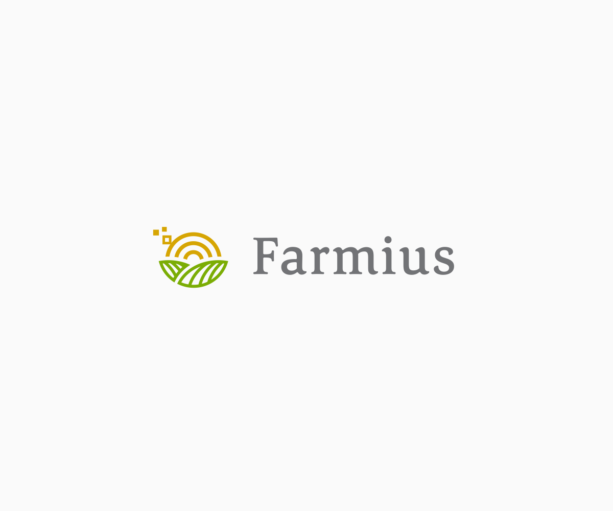
Software for farms needs a logo design
Winner

Want to win a job like this?
This customer received 67 logo designs from 30 designers. They chose this logo design from luiz otavio I DESIGN as the winning design.
Join for free Find Design Jobs- Guaranteed
Logo Design Brief
Farmius is the Friendly Order and Inventory Management for Your Farm Business. The logo can but doesn't have to contain elements suggesting "smart", "accounting/order processing", "delivery", "veggie basket" and the obvious relation to "farming" (country,farm,harvest,wheat)
The logo should be 1-color, the use of opacity is ok. Please include at least 2 variations of logo color and background!
Target Market(s)
Farmers that are sellers of their own products
Industry/Entity Type
Agriculture
Logo Text
Farmius
Logo styles of interest
Pictorial/Combination Logo
A real-world object (optional text)
Font styles to use
Serif
Sans Serif
Look and feel
Each slider illustrates characteristics of the customer's brand and the style your logo design should communicate.
Elegant
Bold
Playful
Serious
Traditional
Modern
Personable
Professional
Feminine
Masculine
Colorful
Conservative
Economical
Upmarket
Requirements
Must have
- It's essential that the logo works within the restrains of profile images on Social (twitter/facebook) as well as the top of a website where it can take more horizontal space. So, ideally, the logo is comprised of the written-out word AND an icon that can stand on it's own on a more square, restricted canvas that doesn't accommodate a word at the same time.
Nice to have
- I'm proposing 2 styles for more direction:
- OPTION 1:
- I'm looking for a contemporary style that makes clever use of lines for the illustrative part of the logo - see examples in the attachement for what I mean, geometry is welcome too, as long as it makes use of farm-related elements - no generic shapes please.
- OPTION 2:
- The use of a custom font that makes the word "Farmius" flow perfectly.
- Example: https://d13yacurqjgara.cloudfront.net/users/154255/screenshots/2909754/plantfarmlogo2_1x.jpg
- For that style, please keep in mind that it should incorporate an illustrative element to meet my "must have" requirement for an element that can stand on its own inside a smaller, square space or act as an icon.
- Additional info, in case this helps: I'm planning on deriving additional icons from the visual language of the illustrative element of the logo. The logo should play nice along illustrations
Should not have
- Please try to avoid generic shapes such as swooshes, company's acronym cut in two colors or the use of the font "Satisfaction". Further, avoid Financial graphics, towers, growth lines, 3d-spheres, trees where the trunks are people or hands, swooshy men, V-men and leafy men, drop shapes alone or mixed with leafs and other elements... you get the basic idea ;-)
Files
PNG
examples Friday, 09 September 2016 17:29:24
Friday, September 9, 2016
Payments
1st place
€120