Logo design for One Accounting Limited
Want to win a job like this?
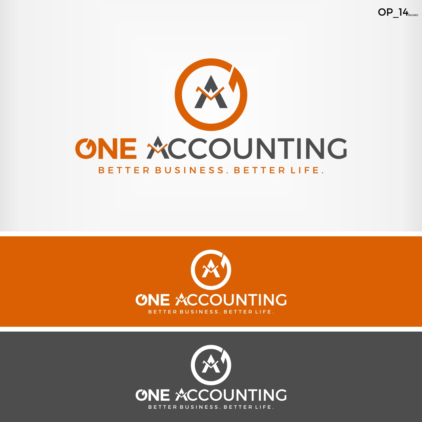
This customer received 159 logo designs from 37 designers. They chose this logo design from Jenny as the winning design.
Join for free Find Design Jobs- Guaranteed
-
 NZ$160
-
 159 designs
-
 37 designers
Logo Design Brief
One Accounting Limited is a modern, young, vibrant, cloud based accountancy firm that focuses on more than just crunching numbers for their clients. One Accounting Limited focuses on adding value and growing their business.
One Account Limited’s name came from the saying “One Team, One Dream”. This means we work with our clients as One Team, to achieve One Dream – Their Dream of a successful business and wealthy future. One Accounting Limited’s slogan is “Better Business. Better Life.” This is the message we want to promote to the client that we can add value not only to their business, but in turn, to their lives. As being a modern new age accountancy firm - we need an awesome logo to represent us! Please see the attached PDF document for full detials.
Target Market(s)
Small to medium size businesses of all industries.
Industry/Entity Type
Accounting
Logo Text
One Accounting. Slogan is :Better Business. Better Life."
Logo styles of interest
Abstract Logo
Conceptual / symbolic (optional text)
Font styles to use
Colors
Colors selected by the customer to be used in the logo design:
Look and feel
Each slider illustrates characteristics of the customer's brand and the style your logo design should communicate.
Elegant
Bold
Playful
Serious
Traditional
Modern
Personable
Professional
Feminine
Masculine
Colorful
Conservative
Economical
Upmarket
Requirements
Must have
- Company Name.
- Slogan.
- Use colours burnt orange, blacks, grey, and one highlight colour if you want.
- Should be modern, simple, clean, slightly abstract, with a hint of accounting.
- See PDF for current logo and examples of logos I like.
Nice to have
- In the current logo the A in Accounting has a graph line going through it. I like the idea of subtle accounting hints through the name. See attached PDF for current logo.
Should not have
- Should not be a "busy" design with too much going on. Should not be "Overtly" accounting - subtle slightly abstract is best.