Logo for Fitness and Wellbeing Coaching Company
Want to win a job like this?
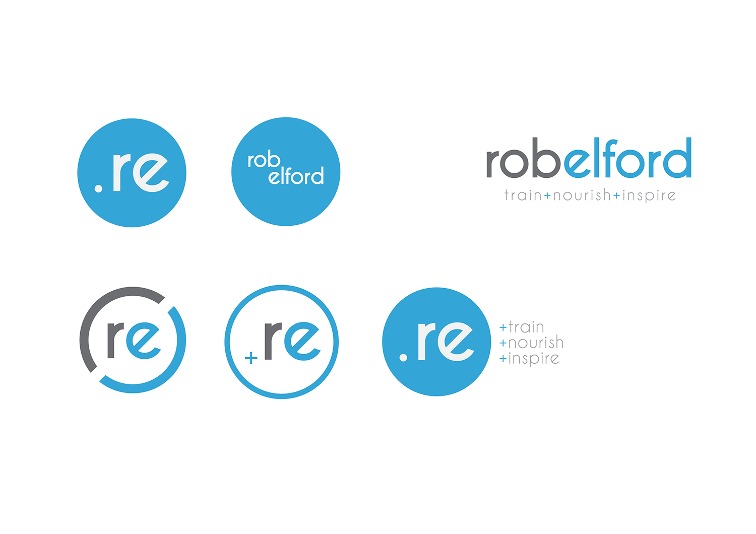
This customer received 109 logo designs from 43 designers. They chose this logo design from Matt Bradshaw as the winning design.
Join for free Find Design Jobs-
 £120
£120
-
 109 designs
-
 43 designers
Logo Design Brief
We need a logo for a long established business of 17 years - training and coaching clients in fitness, nourishment and motivation. The company is 100% reliant on the relationship that the owner and coach has wth his increasing list of clients. We need to avoid anything cheesy of bright coloured - no red please. The colour preference is greys and blues. The strapline for the company is train, nourish and inspire. The logo image needs to portray aspiration, sophistication and appeal to men and women. the logo should be confident yet subtle.
Updates
Would love to see initial designs asap as very urgent
Added Tuesday, August 16, 2016
We have now chosen our final designer and would like to thank everyone for their input.
Added Friday, September 9, 2016
Target Market(s)
Men and women between the ages for 35-50. High income and committed to Fitness and Wellbeing
Industry/Entity Type
Fitness
Logo Text
rob elford
Logo styles of interest
Abstract Logo
Conceptual / symbolic (optional text)
Wordmark Logo
Word or name based logo (text only)
Lettermark Logo
Acronym or letter based logo (text only)
Font styles to use
Colors
Colors selected by the customer to be used in the logo design:
Look and feel
Each slider illustrates characteristics of the customer's brand and the style your logo design should communicate.
Elegant
Bold
Playful
Serious
Traditional
Modern
Personable
Professional
Feminine
Masculine
Colorful
Conservative
Economical
Upmarket
Requirements
Must have
- Positive and motivational
Nice to have
- potential to include the strapline
- train. nourish. inspire
Should not have
- Bright colours
- Cheesy
- complicated fonts
- Gimmicks
- Old fashioned