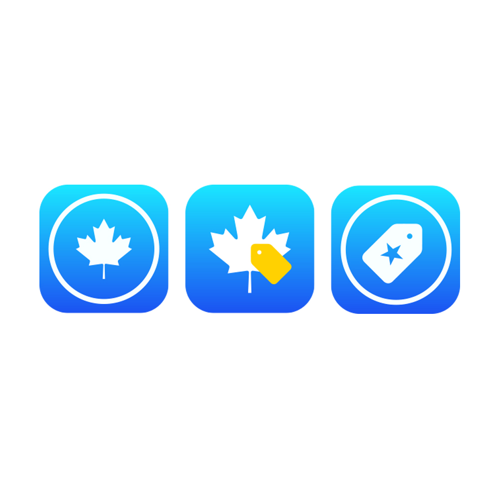
iOS 7 Style App Icons for 3 iPhone apps
Winner

Want to win a job like this?
This customer received 27 icon designs from 8 designers. They chose this icon design from eckographic as the winning design.
Join for free Find Design Jobs- Guaranteed
Icon Design Brief
I have three iPhone apps in the App Store. Each of these currently has an app icon styled for iOS 6.
I will be releasing a new version of each of these three apps optimized for iOS 7.
Since the look and feel of iOS 7 is very different from previous versions (e.g., iOS 6), I need new icons that present the same concepts as the existing ones but following the new iOS 7 look and feel.
Industry/Entity Type
Store
Look and feel
Each slider illustrates characteristics of the customer's brand and the style your logo design should communicate.
Elegant
Bold
Playful
Serious
Traditional
Modern
Personable
Professional
Feminine
Masculine
Colorful
Conservative
Economical
Upmarket
Requirements
Must have
- A) *Each* app icon submitted must be provided in *all* of the following sizes, as required by Apple:
60 x 60 pixels,
120 x 120 pixels
512 x 512 pixels
1024 x 1024 pixels
B) Although the icons are displayed with rounded corners on the iPhone and iPad, the icons submitted to Apple must *not* have rounded corners. In other words, the app icons must be square.
C) The image files need to be provided in png format.
D) For the two Canadian apps (Sales Tax Canada and Tax, Tip & Discount Canada), the app icons must include a maple leaf since that is the most recognizable Canadian symbol.
E) The third app (Sales Tax, Discount & Tip) is not specific to a country.
F) The icons should use the same basic colors found in the apps (blue, yellow and white). The red color *may* be used for the maple leaf symbol but only if that color works well with the other colors.
H) See attached images:
- IOS 7 Home screen showing the look and feel style expected.
- *Current* (old style) app icons for the following apps, in sequence:
1. Tax, Tip & Discount Canada
2. Sales Tax Canada
3. Sales Tax, Discount & Tip (international version)
- All three apps have essentially the same UI. Screenshots of one of the app are provided, along with a third screenshot of the second app which has the same UI but with a different background (blue sky with a few clouds). These are provided to show the main colors used by the apps.
Should not have
- 1. App icons should be mostly, if not completely, flat (little or no 3d effect) in order to follow the iOS 7 style.
The second image file attached displays the current (old style) icons which don't work in iOS 7 because they have 3d effects.
2. Icons should *not* have any gloss effect.
3. Although the three apps' icons can be similar, they must each be different. Simply changing the colors while using the same image is *not* ok.
Files
Download all files - 0.6 MBJPG
image_68576 Thursday, 05 September 2013 02:23:00
Thursday, September 5, 2013
JPG
image_913208 Thursday, 05 September 2013 02:28:27
Thursday, September 5, 2013
JPG
image_128812 Thursday, 05 September 2013 02:35:33
Thursday, September 5, 2013
JPG
image_907418 Thursday, 05 September 2013 02:35:41
Thursday, September 5, 2013
JPG
image_282185 Thursday, 05 September 2013 02:39:17
Thursday, September 5, 2013
Payments
1st place
US$210
Participation payments x 2
US$20