Carnado Car Automotive News Website Logo
Want to win a job like this?
This customer received 23 web designs from 6 designers. They chose this web design from Samphan as the winning design.
Join for free Find Design Jobs- Guaranteed
-
 £140
£140
-
 23 designs
-
 6 designers
Web Design Brief
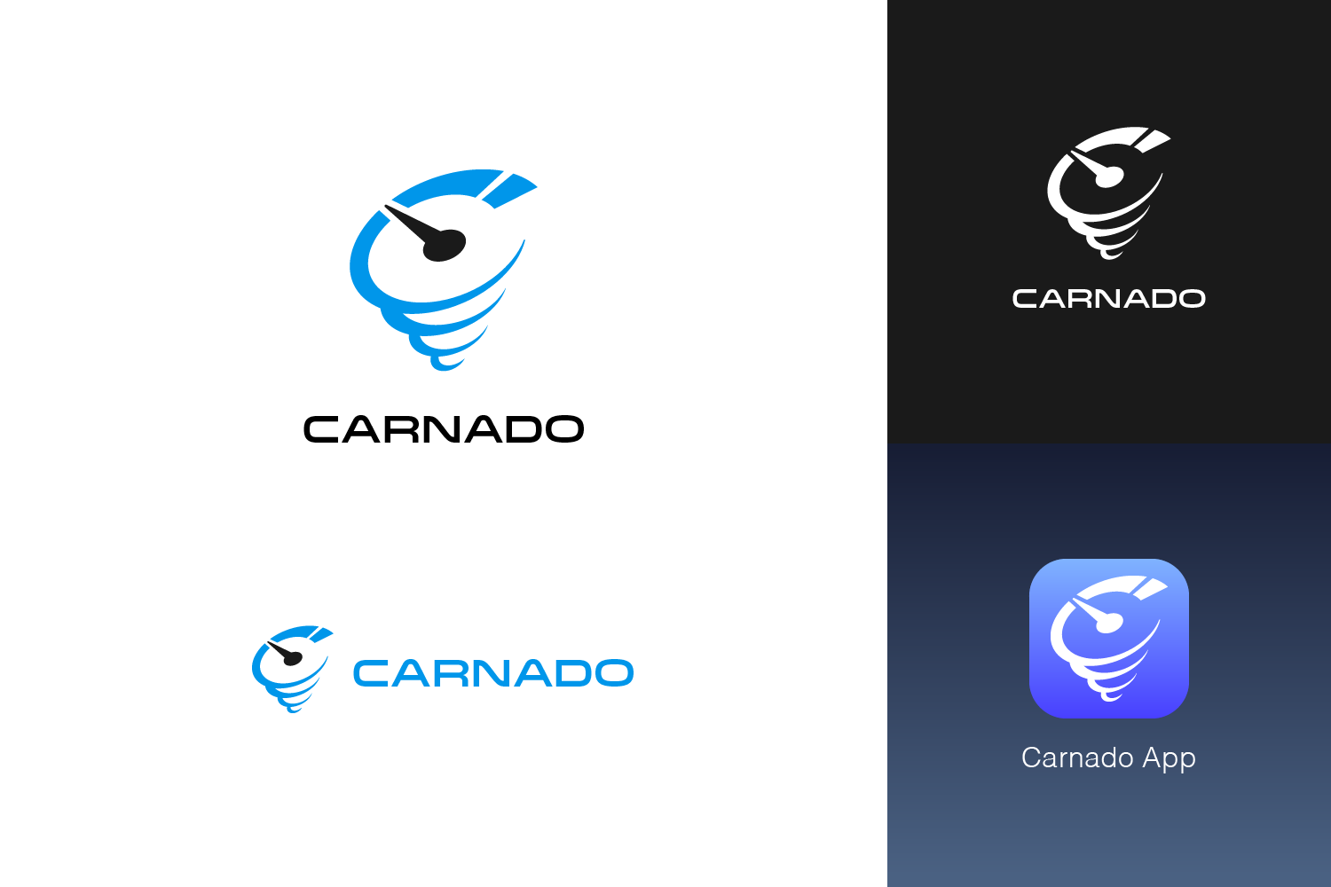
Carnado is a news aggregator website focusing on the best of the current car news and videos and images from across the leading (mostly) UK automotive markets.
The Carnado name is a mix of 'car' and 'tornado' and so the logo should reflect this. It is ‘disruptive’ in that it will change the way many people consume car related media but it will also ‘suck in’ media from other sites, the two aspects of a tornado.
I'd like to explore the colours but Carnado MUST not use black and red together. There two colours are widely used in automotive logos and websites and Carnado must stand out from them visually.
The logo should not have shading or shadowing (see Google, Microsoft, Apple for example) and I do like having an element that I could use separately that is associated with the logo. I expect this will be something like a tornado icon but simplified.
Carnado will also be an App.
Target Market(s)
It will target mostly men ages from 20 yrs to 60 yrs.
Industry/Entity Type
Automotive
Number of Pages Required
1 page
Font styles to use
Look and feel
Each slider illustrates characteristics of the customer's brand and the style your logo design should communicate.
Elegant
Bold
Playful
Serious
Traditional
Modern
Personable
Professional
Feminine
Masculine
Colorful
Conservative
Economical
Upmarket
Requirements
Nice to have
- An icon of some sort to use as an App icon of to use elsewhere on its own.
Should not have
- No black and red logos