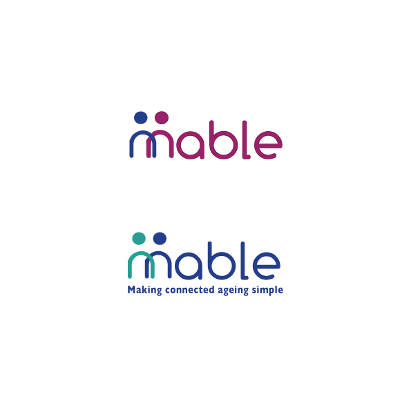
Logo and colour palette: Connecting older people

Want to win a job like this?
This customer received 17 logo designs from 8 designers. They chose this logo design from Hiccups Design as the winning design.
Join for free Find Design JobsLogo Design Brief
Needs to project a friendly service that is simple and intuitive to use. To attract consumers who are not comfortable with technology to trust us to provide them with a useable service that will improve their lives.
Warm inviting colours, large and easy to read.
Logo and colour palette will be used as identity for web and application designs. Therefore output needs to be the logo and the colour palette for the company.
Target Market(s)
Three markets - care providers; younger family members of older people; older people
Industry/Entity Type
It Company
Logo Text
"Mable" plus we need to see logos with and without the strapline "Making connected ageing simple"
Logo styles of interest
Emblem Logo
Logo enclosed in a shape
Pictorial/Combination Logo
A real-world object (optional text)
Look and feel
Each slider illustrates characteristics of the customer's brand and the style your logo design should communicate.
Elegant
Bold
Playful
Serious
Traditional
Modern
Personable
Professional
Feminine
Masculine
Colorful
Conservative
Economical
Upmarket
Requirements
Should not have
- avoid images of old people and associated cliches; avoid reds; mustn't look like an IT or technology company